

7 Website Mistakes That Could be Costing you Clients
DIYing your website is not the problem. In fact, we love a good DIY website moment around here!
We truly believe that building your own website can be a great option, especially when you’re first starting out. It gives you a way to get your business online, start sharing what you do, and create a polished home for your brand without jumping straight into expensive custom design.
But there are a few crucial things that are so commonly overlooked.
Your website might look cute, but it also needs to actually do its job. It should help people understand what you do, trust that you’re the right fit, and feel confident taking the next step, whether that’s enquiring, booking, buying, or joining your email list.
So in this post, we’re walking you through the most common website mistakes that could be making your site harder to use, harder to trust, and harder to convert.
Let's dive in!
Quick Website Mistakes Checklist
Before we dive in, here are the big ones to look for:
Your homepage does not clearly explain what you do
Your copy is too vague, fluffy, or hard to skim
You are not giving visitors a reason to join your email list
Your navigation has too many choices
Your mobile layout is not easy to use
You are not showing testimonials or trust-builders
Your site loads too slowly
If you’re nodding along already, don’t panic. These are all fixable and a few small updates can make your website feel so much clearer and more professional.
Mistake 1: Not Clearly Explaining What You Do
It might sound pretty obvious, but this is one of the most common website mistakes we see: landing on a website and not being able to immediately tell what your business actually does.
Here’s the thing, people don’t actually sit down and carefully read every single word on a website these days. They skim. Their eyes dart around while they quickly look for clues to tell them what your business is about, whether it's relevant to them, and what they should do next.
So if it’s not immediately clear what you offer, who it’s for, or how you can help, there’s a really good chance that your site visitors will click away before they even get to the good stuff.
That’s why your homepage (ie. the first place they land) needs to clearly explain what you do in one or two simple sentences. Of course, you can go into more detail further down the page, or on your About, Services, or Shop pages. But first, you need to capture your visitors' attention and give them a reason to stay.

That doesn’t mean it has to be boring. It just needs to be clear first (and cute second).
For example, instead of something vague like:
Helping you bring your dreams to life.
Try something more specific, like:
Custom brand photography for creative small businesses in Austin.
See the difference? The second version actually tells people what’s being offered and who it’s for.
A good rule of thumb: if someone landed on your homepage for five seconds, would they understand what you do? If the answer is “umm maybe?” it’s probably time to simplify your message!
Mistake 2: Too Much Copy Fluff
This one goes hand-in-hand with mistake number one.
Once people understand what you do, your website copy needs to help them keep moving, not slow them down with giant paragraphs, vague statements, or lots of words that sound nice but don’t really say anything. Because again, people skim.
They’re not reading your homepage like a novel. They’re quickly scanning your headings, buttons, section titles, and short bits of copy to figure out whether they’re in the right place and what they should do next. So if your website is full of long, chunky paragraphs or fluffy phrases that don’t give people clear information, your visitors are probably going to get bored, confused, or both. And confused people are not usually the ones clicking “buy now” or “book a call.”
The goal is not to strip your website of all personality. Please don’t do that. We love a little sparkle and copy that actually sounds like a human wrote it! But your copy still needs to do its job and that means making sure each section is clear, easy to skim, and actually helping your visitor understand all the important things.
This is especially important on your homepage. Your homepage is not the place to explain every single detail of your business. It’s there to guide people through the most important parts of your site and help them choose their next step, whether that's learning more about you on your About page or building trust by visiting your Portfolio.
You can always go deeper on your Services page, About page, Sales pages, or Blog, but on your main pages, keep your copy short, specific, and easy to skim.
Always keep in mind when you’re writing your copy:
Is it clear: If someone who has no idea what I do stumbled across my site, would they understand what I do now? Am I using basic language and not confusing anyone?
Is it short and sweet: The longer the paragraph, the faster people are going to skim read this, will they be able to pull out main points and get the jist?
Mistake 3: Email Opt-ins
You’ve done the hard yards. You’ve set up your website, you’re selling your products or services, and people are actually visiting your site. Amazing!
So… why aren’t you getting those people on your email list?
If people are already landing on your website, you don’t want to waste those visits. Not everyone is going to be ready to buy, book, or enquire the second they find you, but that doesn’t mean they’re not interested. Sometimes they just need a little more time and a little more trust before they’re ready to take the next step.
That’s where your email list comes in.
If you don’t have one yet, or you’re not totally sure why you need one, check out this post on why an email list is essential if you ever plan on scaling your business.
An email list is basically a list of people's email addresses who have given you permission to email them. You can use platforms like Mailchimp, Kit, Flodesk, or Squarespace Email Campaigns to collect email addresses and send emails to your subscribers.
Most importantly, your email list gives you a way to stay connected with people after they leave your website, allowing you to stay in people's inboxes and minds instead of relying on visitors maybe remembering to come back and visit your site again one day.
Add a Freebie
If you already have an email list and newsletter form on your website, well done, you're doing great! If you're finding not enough people are signing up though, you probably don’t have an enticing enough offer.
We all know what it’s like to have way too many emails pouring into our inboxes every day, so people are understandably a little protective of their email addresses. This means a simple “sign up to my newsletter” or “join the list” usually isn’t going to be enough on its own. You need to give people a reason to subscribe.
That could be:
A discount code for their first order
A free workbook
A checklist
A mini course
A quiz
A free template
Free design resources
A helpful guide that solves a specific problem

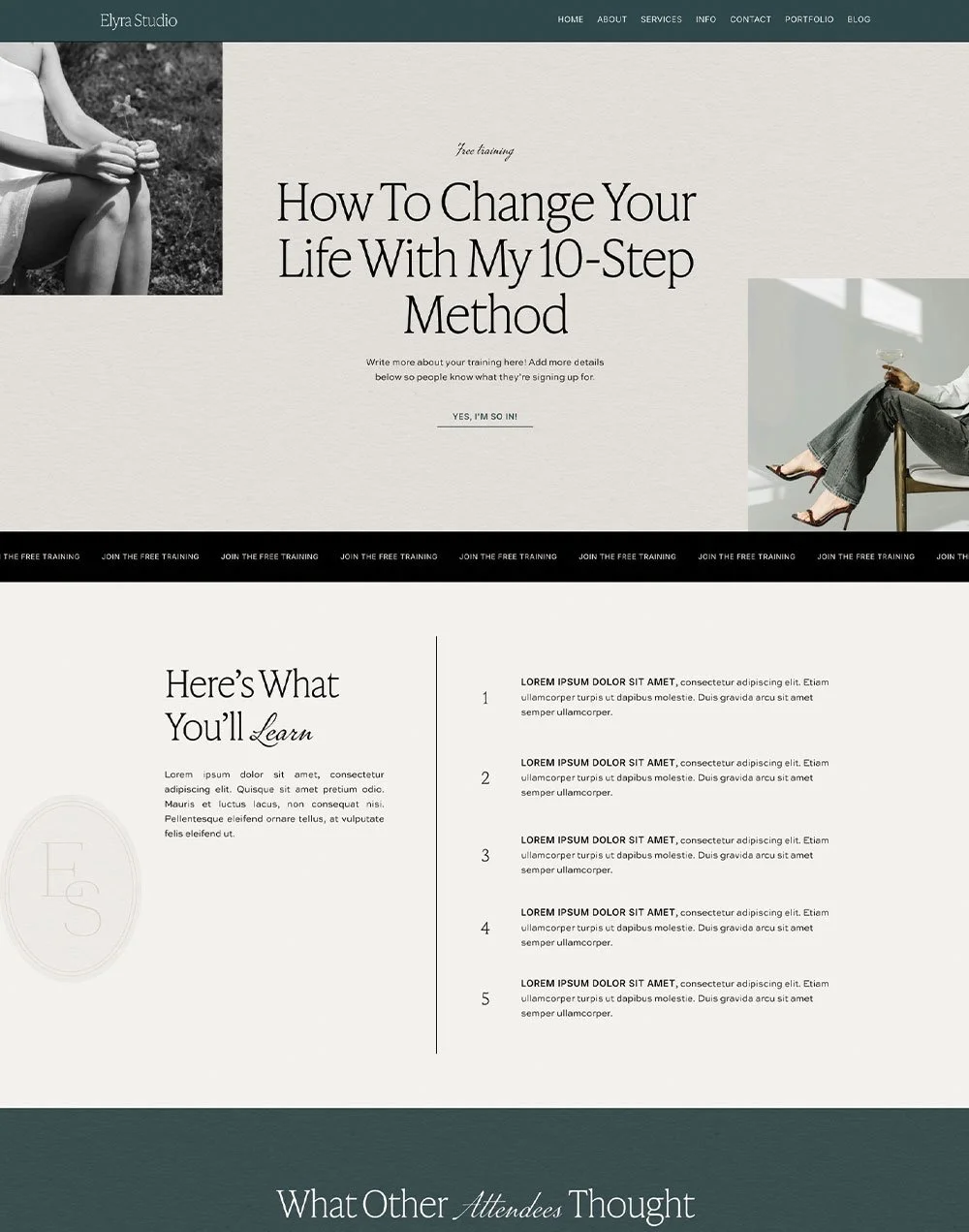
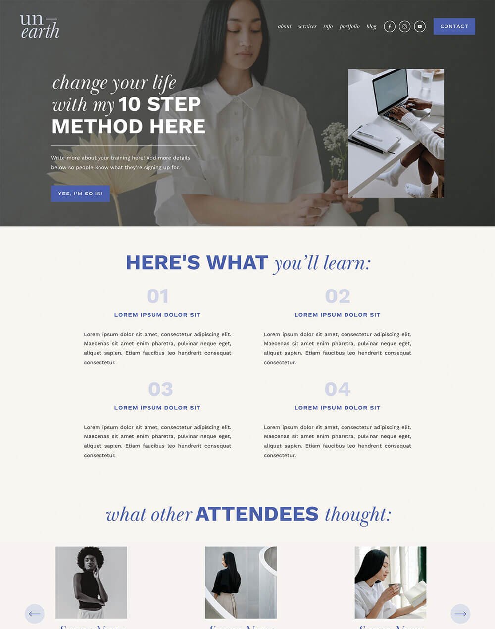
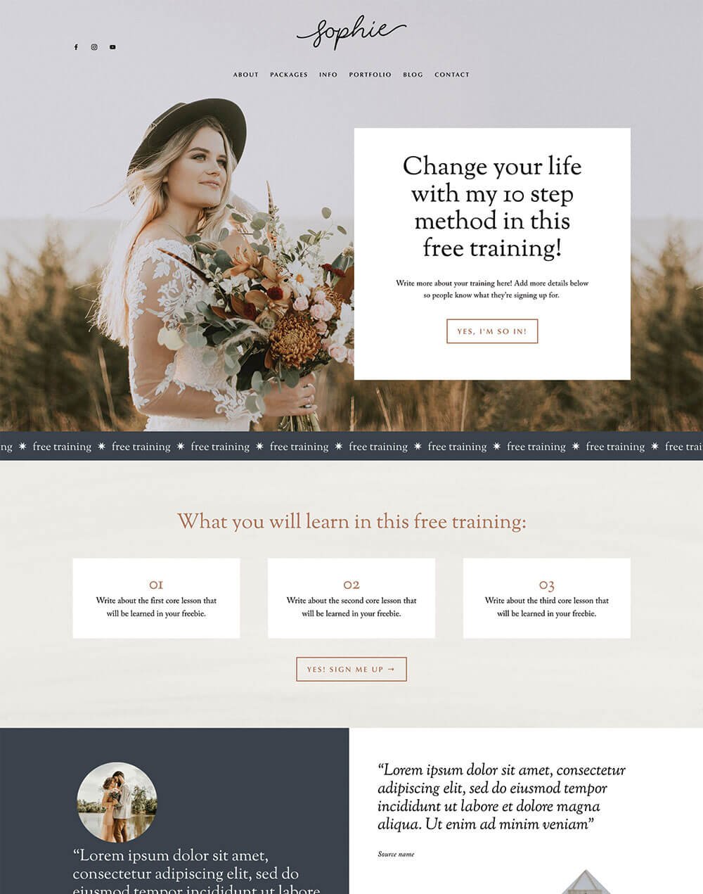
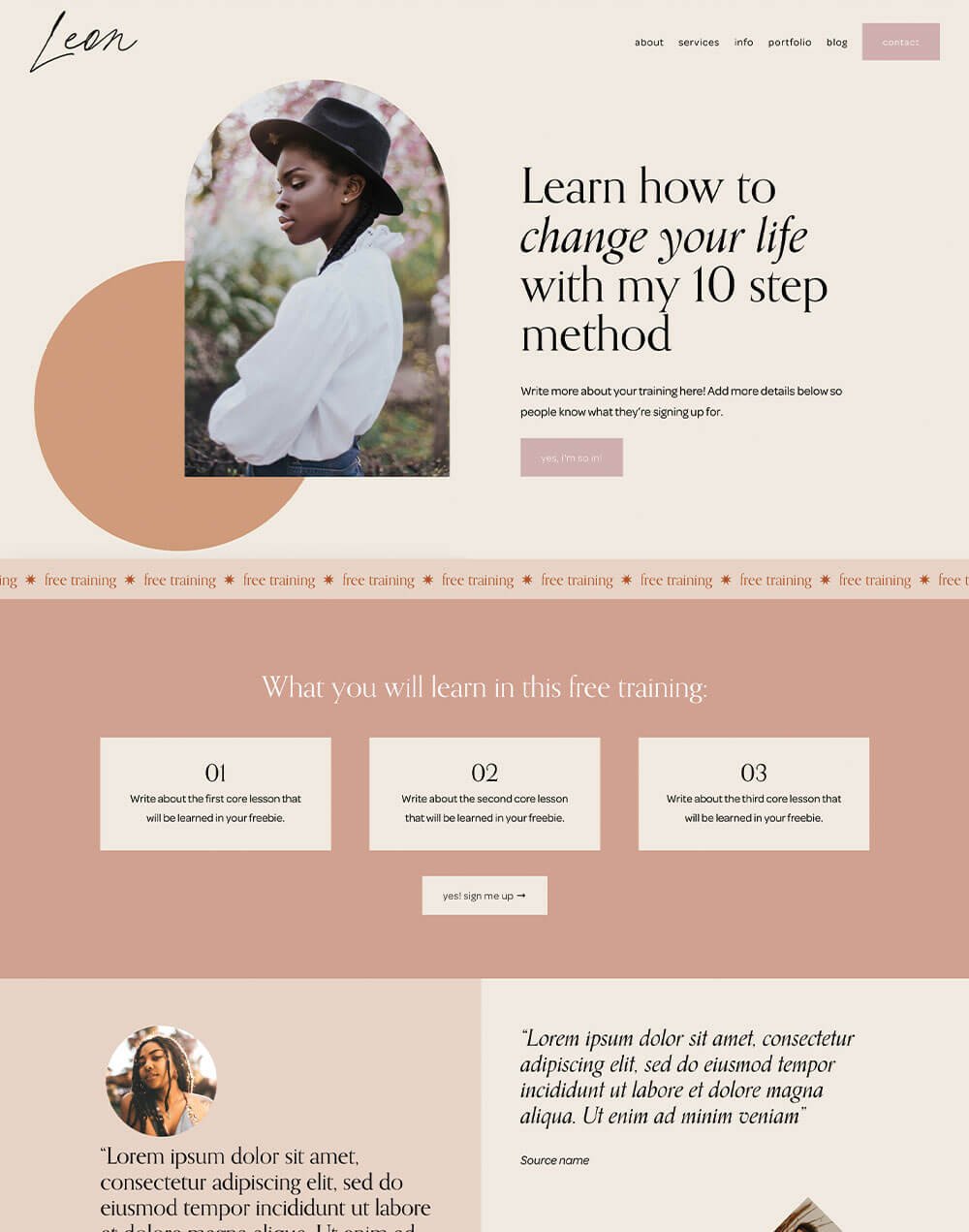
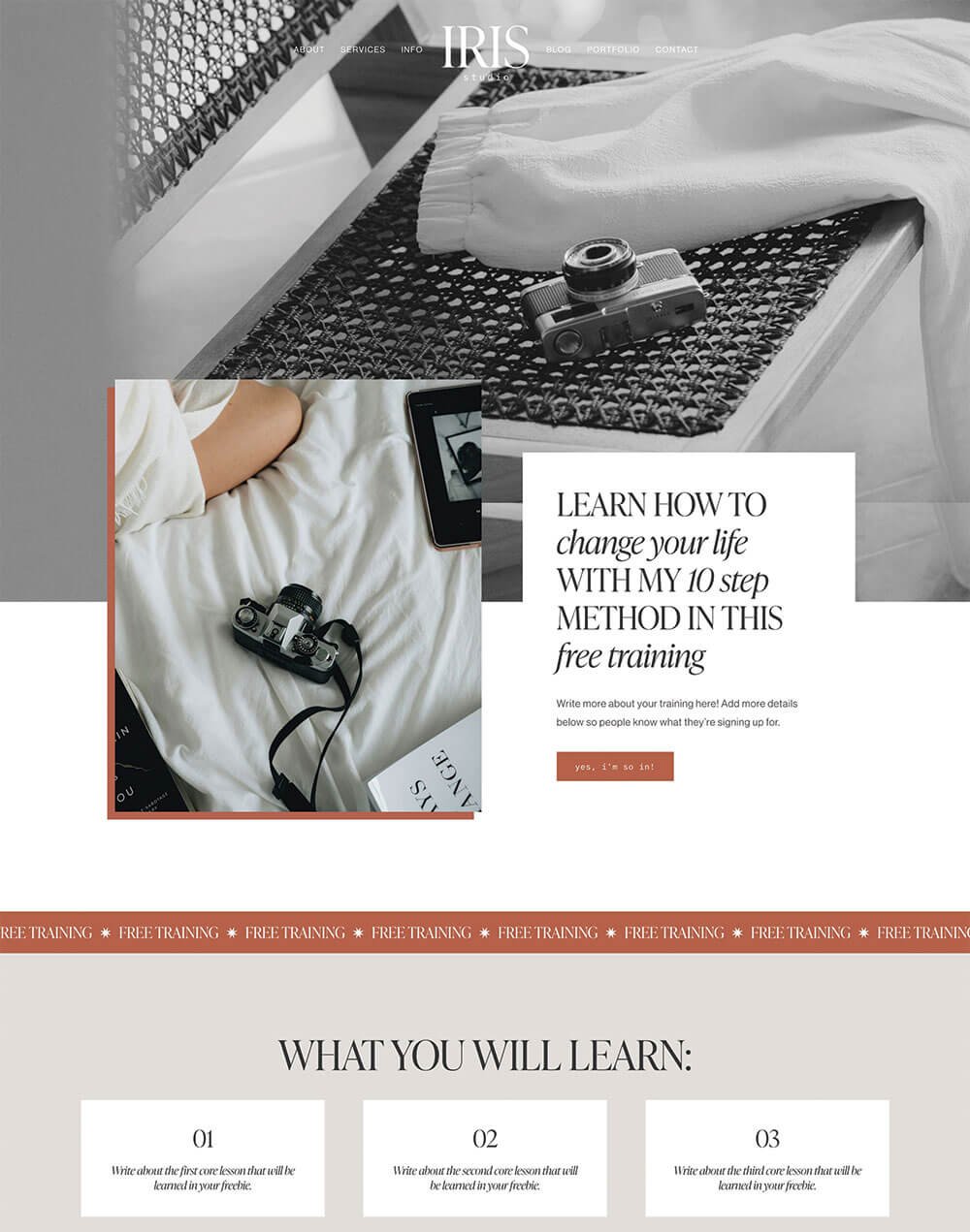
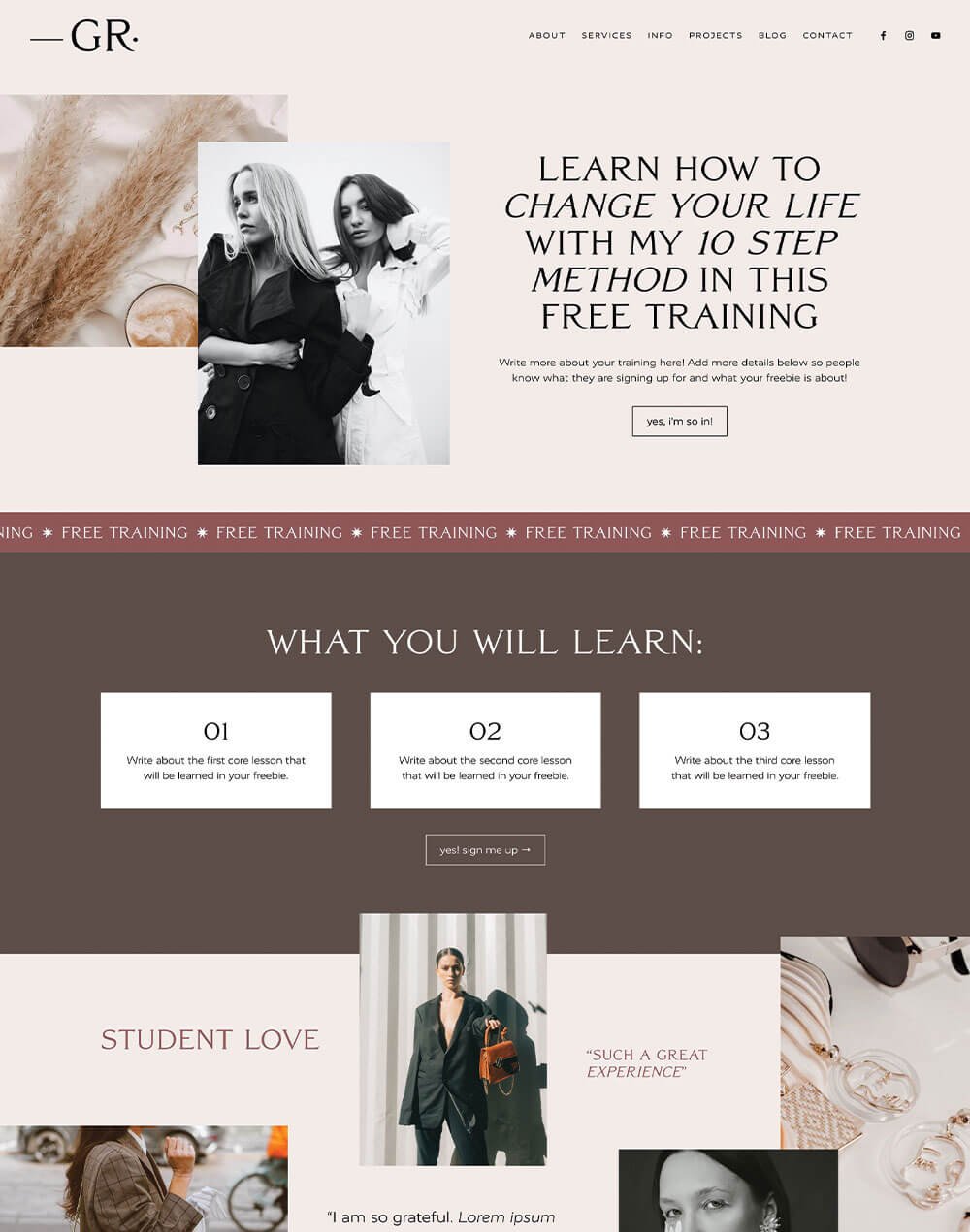
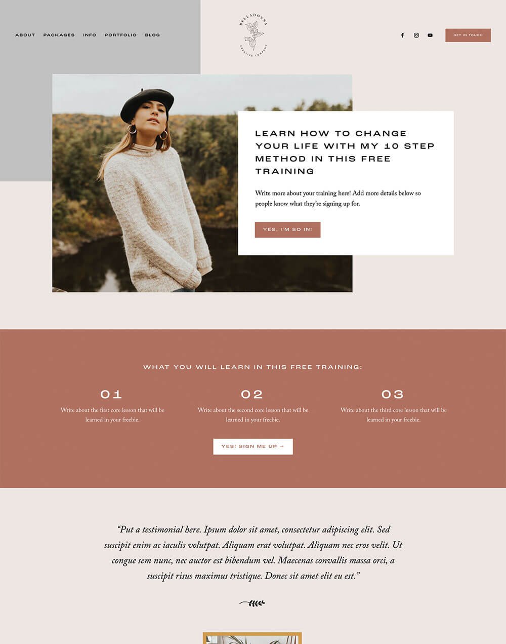
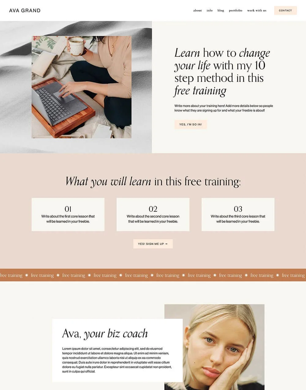
Example of a freebie opt-in from our Unearth Squarespace Template
👉 Everything You Need to Know to Create Freebies That (actually) Grow Your Email List
Make sure whatever you’re offering is something that your ideal customer would want.
You don’t just want anyone on your email list. You want the right people because they are the ones who are genuinely interested in what you offer and might want to buy, book, or work with you later.
👉 How to get started with email marketing: a simple guide for beginners
👉 How to add Flodesk to Squarespace
👉 Should you use Squarespace Email Campaigns? Pros, Cons, and Alternatives
PS. Did you know that all of our Squarespace templates have matching freebie page add-ons available, strategically designed to get you more leads? Check them out below:


Mistake 4: Too Many Navigation Tabs
This all comes back to keeping things nice and simple for your visitors, but this time we’re talking about your navigation, especially your main navigation. You know, the links across the top of your website.

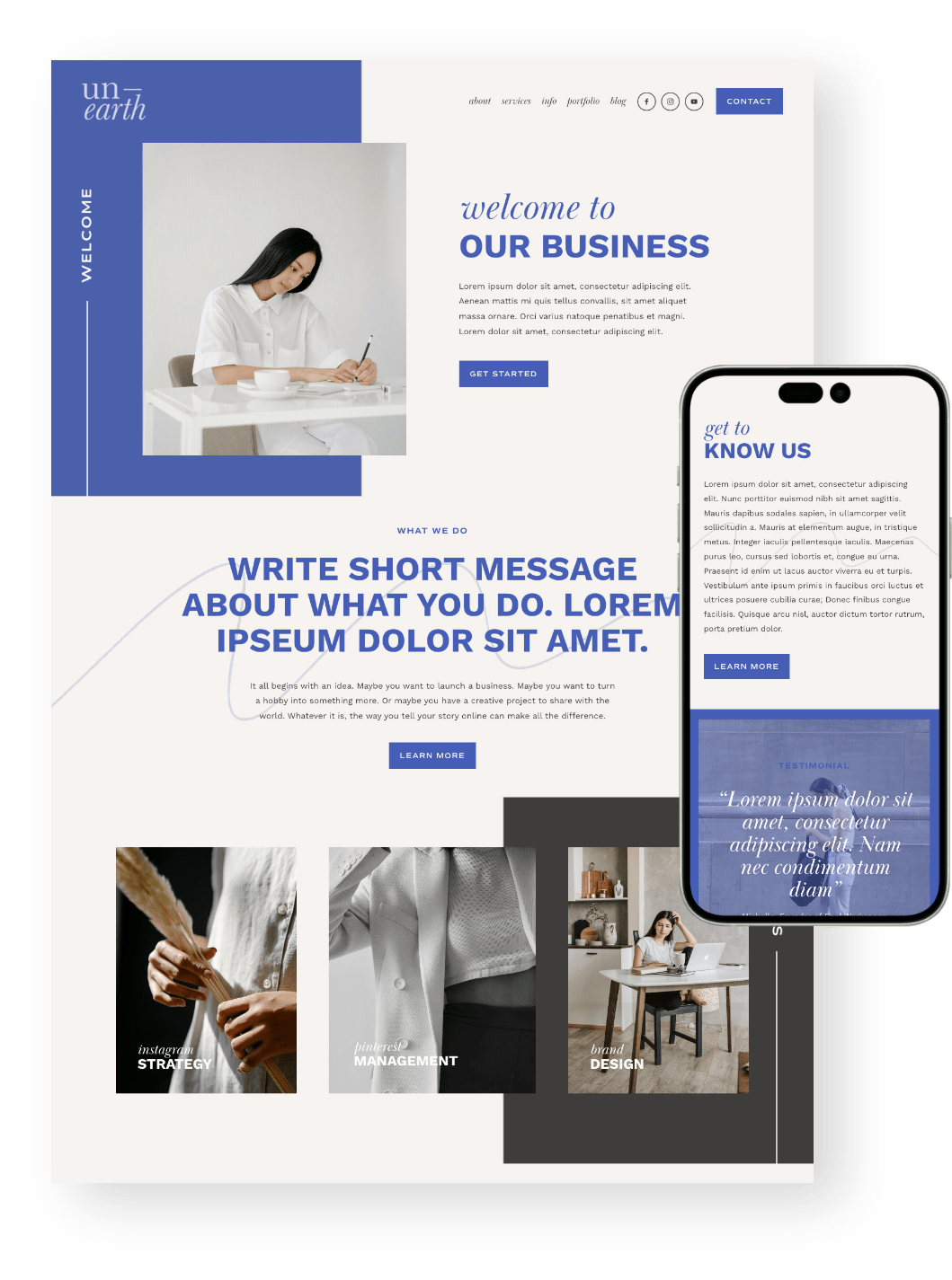
Header navigation in our Unearth Squarespace Template
And we get it. Your navigation can get hectic really quickly, especially when you have lots of pages.
But your main navigation is not there to hold every single page on your website. It’s there to guide people toward the most important places. So before you add another link to your header, ask yourself: where do I actually want people to go?
Usually, your main navigation should include the pages that help people understand your business, explore your offers, and take the next step. Everything else can often live in your footer, a dropdown menu, or be linked from another page.
A good rule of thumb is to keep your main navigation to around 5–6 links or less.
And if there’s one main action you really want people to take, like “Shop,” “Book a Call,” or “Start Here,” you can make that your header button instead of squeezing it in as another regular link for extra visibility.
👉 How to Add a Button to Your Header Navigation in Squarespace
The goal is not to send everyone everywhere. As much as we’d love visitors to lovingly explore every single page on our websites, that’s not usually how people browse. If you give them too many options, they’re more likely to get overwhelmed and click away.
So be a little cutthroat here. Choose the pages that matter most, keep your navigation clear, and use your footer for the extra bits and pieces. Your visitors do not need every possible option at once. They just need a clear next step.
👉 How to create a sticky header navigation in Squarespace
👉 10 Fun Customisations for Your Header Navigation Menu in Squarespace
👉 How to Customize your Header Navigation in Squarespace 7.1 Fluid Engine (2024 update)
Mistake 5: Your Website Isn’t Optimized for Mobile
This is one of the biggest website mistakes you can make, because so many people are visiting websites directly from their phones these days!
And yet, what your website looks like on mobile is often the last thing to get checked... right at the very end of your website build, when you’re tired, over it, and so ready to just launch.
Your website might look beautiful on desktop, but if the mobile version feels cramped, confusing, or hard to use, a huge chunk of your visitors might be very quickly navigating away.
A mobile-friendly website should be easy to read, easy to scroll, and easy to take action on. Your visitors should not have to pinch, zoom, squint, or play a tiny-button obstacle course just to enquire, shop, or find what they need.
The great thing about Squarespace is that you can customize your mobile layout almost entirely on its own, so you’re not stuck hoping your desktop design magically works on a smaller screen.
👉 How to Customize Your Mobile Design in Squarespace 7.1 With the New Fluid Engine Editor
👉 Hacks to Make Mobile Editing in Squarespace Fluid Engine Faster
Before you launch, go through your site on your actual phone and check things like:
Is your text easy to read?
Are your buttons easy to tap?
Are your images cropping nicely?
Is there too much awkward spacing?
Do your sections appear in the right order?
Is your navigation easy to use?
Are your forms simple to fill out?
Pro tip! Starting with a template that’s been designed for both desktop and mobile can save you a lot of time, especially when you get to those final pre-launch checks.


Mistake 6: Not Displaying Customer Testimonials
Showcasing testimonials from your customers or clients is so, so valuable.
When you go to buy a product online, or invest in a service, you always read the reviews or testimonials first. Visitors are so much more likely to purchase if there’s proof that someone else (or multiple people) believe that it’s a solid investment.
That’s because people want to know that someone else has had a good experience before they take the leap. Testimonials help build trust, answer niggly doubts, and reassure your visitors that yes, this is a solid investment.
Don't worry, your testimonials don’t need to be fancy. A simple, genuine testimonial from a happy customer can do a lot of heavy lifting on your website just on its own!

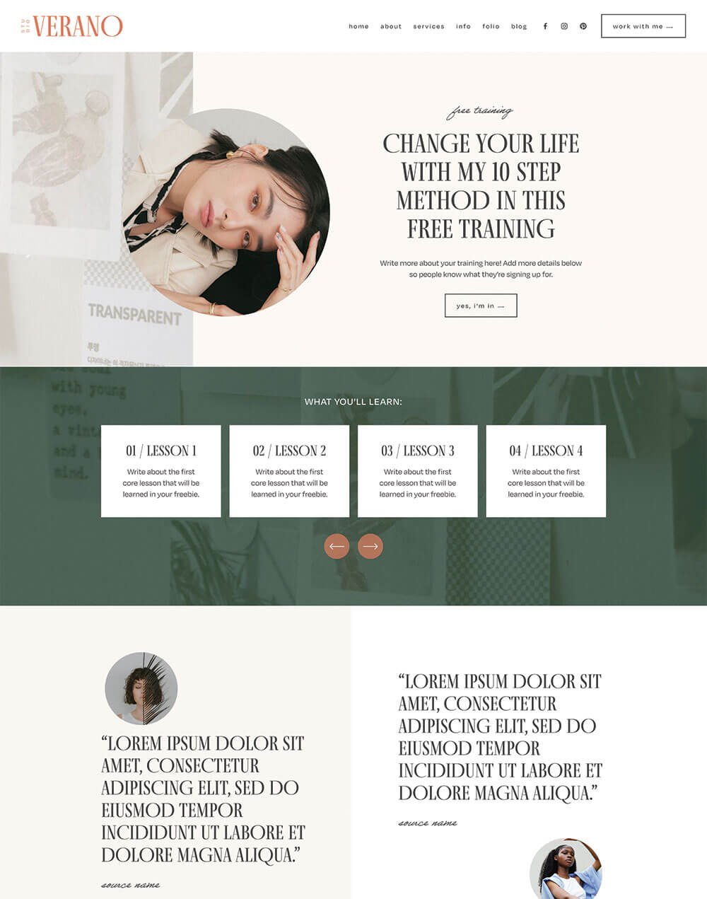
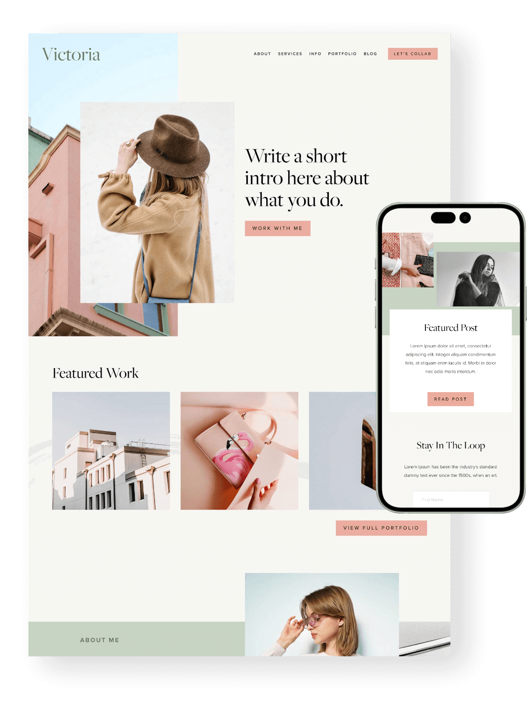
Testimonial section in our Verano Squarespace Template
If you haven’t started collecting testimonials yet, you should do so ASAP! You can reach out to past clients or customers with a short, friendly email and ask if they’d be happy to share a few words about their experience. To make it easier, you can even give them a few prompts, like:
What were you struggling with before?
What made you choose this product or service?
What changed after working together or buying?
What would you say to someone thinking about doing the same?
Once you have testimonials, don’t just hide them on one lonely reviews page. Sprinkle them throughout your website where they naturally support the next step, like your homepage, services page, sales page, product pages, or near your enquiry form.
You can also use other trust-builders alongside testimonials, like client logos, portfolio examples, case studies, star ratings, or screenshots of kind words from customers.
Basically, don’t make people just take your word for it. Show them that other people have been here, loved it, and would happily recommend you too!
👉 How to create a review slideshow in Squarespace 7.1
👉 How to add Google, Airbnb, and Facebook Reviews to Your Squarespace Site
Mistake 7: Your Website Takes too Long to Load
Eek, this is a big one. Remember how we said people don’t really sit down and carefully read every single word on your website? Well, they also don’t really like waiting around for your website to load either.
We are all very impatient internet gremlins these days, and if your site takes too long to load, there’s a good chance people will just click away and not bother waiting.
One of the biggest culprits here is oversized images.
Beautiful, high-quality images are great, but uploading giant image files straight from your camera, designer, or stock photo site can seriously slow things down, especially on mobile.
Before you upload images to your website, it’s worth taking a few extra minutes to resize and compress them. This helps keep your pages loading faster without sacrificing the overall look and feel of your site.
👉 How to optimize images for Squarespace
A few other things that can slow your site down:
Huge background images
Too many autoplay videos
Extra plugins or code you don’t really need
Large PNG files where a JPG would work better
Too many custom fonts or heavy design elements
It sounds a little techy, but it’s not. Just a few extra steps to compress your images before you upload them, and your visitors will be zooming around your site in no time!
And there you have it: 7 common website mistakes that could be making your site harder to use, trust, and buy from.
The good news? It's all fixable! A few small tweaks, like clarifying your message, simplifying your navigation, checking your mobile layout, or adding stronger testimonials, can make a really big difference.
Want more website tips? Check out the posts below:
Where to Promote Your Offers on Your Website (So They Actually Convert)
How to use a Website Template if you Already Have an Existing Squarespace Website
How to add an Email Sign-up Form to your Squarespace Website
Website Pages That Will Increase Your Revenue (and you Should add Today!)
How to Design and Optimize Your Homepage for Better Results
