

How to Add a Button to Your Header Navigation in Squarespace
Adding a button to your website’s primary navigation allows you to establish a clear call to action for website visitors. From the start, you can highlight the action you want visitors to take and make it easy for them to do so - whether it’s booking an appointment, visiting your shop, or contacting you for more information!
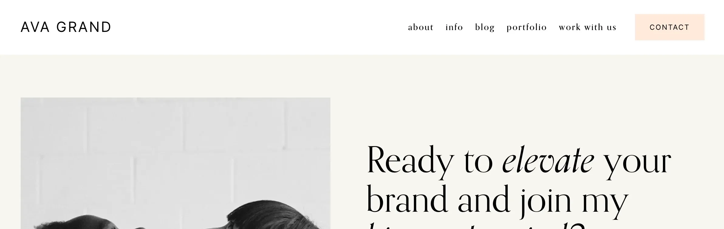
Example Header Navigation Button from our Ava Grand Suarespace Template
Header navigation buttons are available in both Squarespace 7.0 and 7.1, but the universal features of Squarespace 7.1 make implementing it a bit easier.
We’ve put together a quick guide to show you how to implement a header navigation button in both Squarespace 7.0 and 7.1 to fit whichever version your site is on. Let’s get to it!

How to Add a Button to Your Header Navigation in Squarespace 7.1:
Click EDIT on your site, and hover over the header. Then click EDIT SITE HEADER.

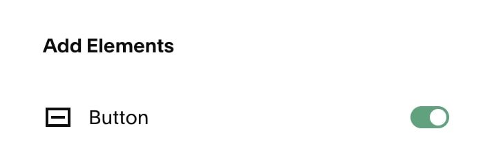
Next, click on the +Add Elements button that appears on the left hand side.
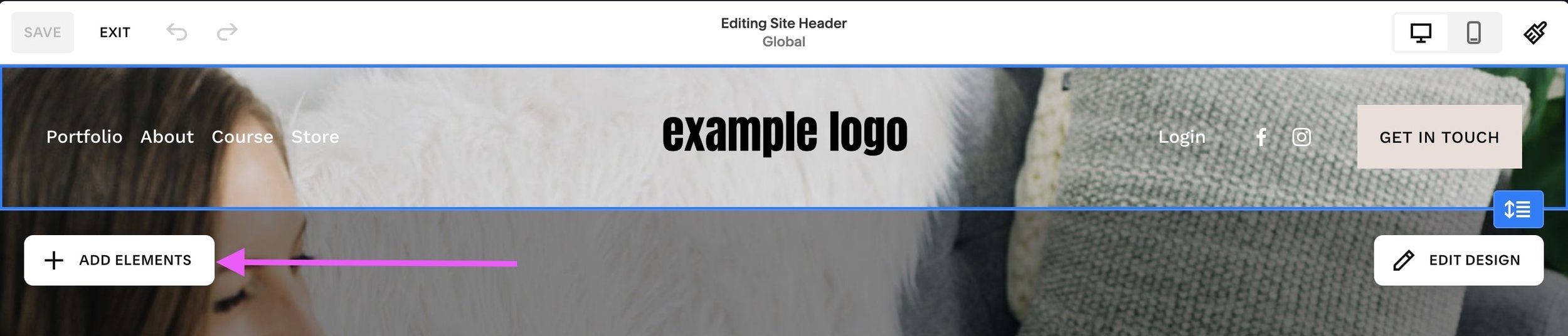
Switch the Button toggle on to activate the button in your header navigation.
Once you activate this button option, you’ll be able to see a button in your header navigation. To customize it, click out of the Elements menu, and click on the button in your site header, then click the pencil icon.

In the pop up menu, you'll be able to customize the button text as well as add a link.

As well as choose the button style under the Design tab.

Note! You can customize the button styles further by clicking EDIT BUTTON STYLES however any site styles changes that you make will apply site wide 👉 How to Edit your Button Design in Squarespace 7.1
Once you're happy with the way your button looks, click out of the settings panel, and click Save on your page.
Easy, right? You now have a button in your header in your 7.1 site!
👉 To learn how to customize your site header further, check out this post!
How to Add a Button in the Header of your Squarespace 7.0 site, Depending on Your Template
How we go about adding a button to the navigation is going to differ based on the template family you’re using.
The Bedford 7.0 template family supports this feature the best by automatically transforming the last navigation link into a styleable button. You can edit the button text directly from the page editor and customize the button in the Site Styles panel.
The Brine 7.0 template family supports changing the Secondary Navigation to a button. You do this by changing your Secondary Navigation style to Button under Design > Site Styles. This can be quite limiting though, as you may want to use both navigation options and have a button, so we have included some extra code below.
In all other Squarespace 7.0 templates, you’ll need to implement a bit of CSS to target the last link and transform it into a button. The trickiest part is knowing how to target the last link, as this differs between templates, but we’ve put together the code you need to implement this feature on some of the most popular 7.0 templates.
Just copy the CSS below and paste it into your Design > Custom CSS area. This will automatically turn the last link into a button. Then use the instructions further down to customize the CSS.
If you're not sure which Squarespace 7.0 template you're using, use these instructions to find out.
Brine & Farro Template Families
Add a button to the PRIMARY Nav:
.Header-nav--primary .Header-nav-item:last-child {
   background: #000000;
   color: #ffffff !important;
   padding: 10px 20px !important;
   border-radius: 30px;
   border: 2px solid #ffd966;
}
Add a button to the SECONDARY Nav:
.Header-nav--secondary .Header-nav-item:last-child {
   background: #000000;
   color: #ffffff !important;
   padding: 10px 20px !important;
   border-radius: 30px;
   border: 2px solid #ffd966;
}
Avenue Template Family
.main-nav>ul>li:last-child a {
   background: #000000;
   color: #ffffff !important;
   padding: 10px 20px !important;
   border-radius: 30px;
   border: 2px solid #ffd966;
}
Five Template Family
nav#main-navigation>ul>li:last-child a {
   background: #000000;
   color: #ffffff !important;
   padding: 10px 20px !important;
   border-radius: 30px;
   border: 2px solid #ffd966;
}
Pacific & Jones Template Families
div#mainNavWrapper nav > div:last-child a {
    background: #000;
    color: #fff !important;
    padding: 10px 20px !important;
    border-radius: 30px;
    border: 2px solid #ffd966;
}
York Template Family
Add a button to the PRIMARY Nav:
div#mainNavWrapper .nav-item:last-child a {
    background: #000000 !important;
    color: #fff;
    padding: 10px 20px !important;
    border-radius: 30px;
    border: 2px solid #ffd966;
}
Add a button to the SECONDARY Nav:
div#secondaryNavWrapper .nav-item:last-child a {
    background: #000000 !important;
    color: #fff;
    padding: 10px 20px !important;
    border-radius: 30px;
    border: 2px solid #ffd966;
}
Customizing the CSS Code in Squarespace to Change Your Header-Nav Button
The code above will give you a pill-shaped button that has white text with a black background with a thin yellow border. This is easily customizable to fit your website’s look and feel by changing the CSS parameters:
You can change the button’s background and font color by inputting the hex code of the color you’d like to use in place of those provided:
background: #000000;
color: #ffffff !important;
Changing the values of the padding property will increase or decrease the amount of space you have around the button’s text.
The first figure (10px) controls the button’s height. Increasing or decreasing this value will change the padding of the button on the top and bottom. The second figure (20px) controls the button’s width. Increasing or decreasing this value will change the padding of the button to the left and right of the text.
padding: 10px 20px !important;
Another customization is changing the shape of the button. This is done through the border-radius property. Changing this to 0px will remove the border-radius and bring you back to the standard rectangle button. Adding a border-radius value will round the edges into a pill shape.
border-radius: 30px;
One additional customization you can make is changing the button border.
By changing the first value (2px), you can increase or decrease the weight of the border.
The second value is the border-style property. You can replace “solid” with a variety of values, like “double” to specify a double border or “dashed” to specify a dashed border. Check out this list of property values that work here.
The last value will change the color of the border. You can input the hex code of the color you’d like to use.
border: 2px solid #ffd966;
If you don’t want a border, you can erase the border property altogether (just delete that whole line from the code)!
When you’ve finished editing your CSS code remember to click Save in the top left corner.
That's it! Hopefully, you have a beautiful button in your Squarespace header now 🙂
Want more tips? Check out the posts below!
How to create a sticky header navigation in Squarespace
How to add a header video to your Squarespace 7.0 or 7.1 site
How to create a full width Instagram feed in Squarespace 7.1
Creating an “as featured in” logo bar on Squarespace
How to create a vertical line in Squarespace (7.0 & 7.1)
If you liked this post, Pin it to Pinterest! 👇🏻
