

How to Edit your Button Design in Squarespace 7.1
Design details matter! Having a button design that streamlines your website’s entire appearance is like the icing on the cake: it makes everything that much better.
Luckily, Squarespace has recently updated the customization capabilities of their buttons, and rather than needing to add in code to take your design to the next level, you can now just tweak a few things directly in the platform!
This article will teach you everything you need to know about customizing your buttons in Squarespace 7.1.

Three different button styles
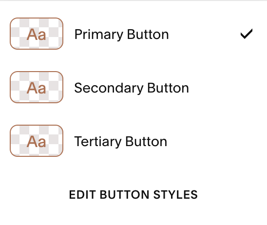
In Squarespace, there are three button styles: primary, secondary, and tertiary.
When you add a standard Button Block to your page, you can toggle it between primary, secondary, and tertiary. Though there are other buttons around your site to consider, too:
Which buttons will be affected when each of the styles is adjusted:
Primary: button blocks set to primary, add to cart buttons, auto layout buttons, checkout buttons, form block submit buttons, donation block buttons, member sign up block buttons, newsletter block buttons
Secondary: button blocks set to secondary
Tertiary: button blocks set to tertiary
Using different button designs is a smart way to distinguish between different call-to-actions and to highlight different types of links around your website.
We recommend having your main primary button design and then only making slight variations to the secondary and tertiary button designs. Enough to tell that they are different, but not so different that they look out of place together!
How to edit your button designs
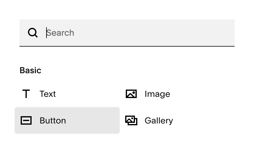
Navigate to any page in your website (preferably one with a button design present so you can see the changes you are implementing)
Click EDIT in the top left corner

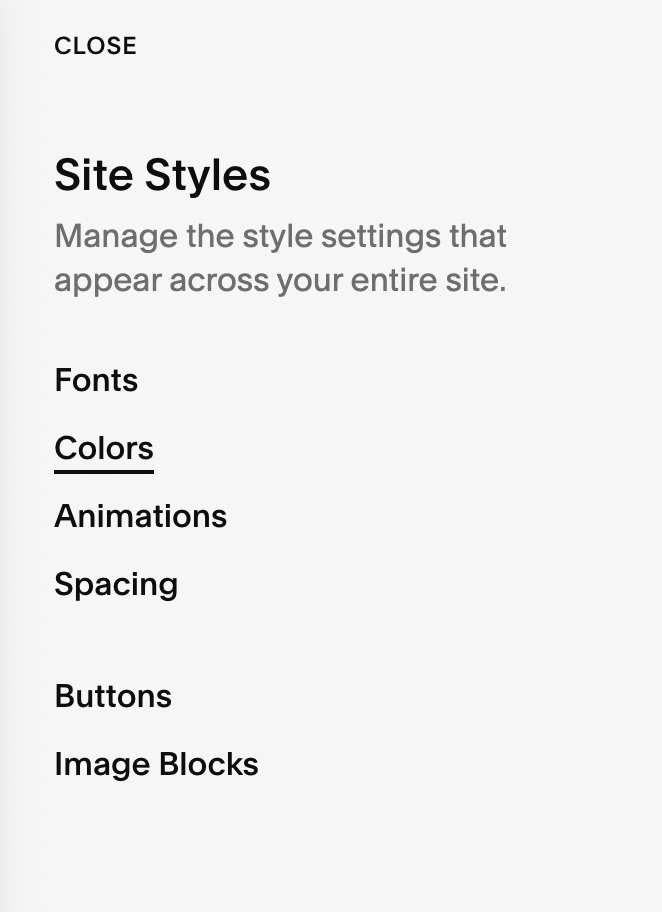
Click the paintbrush icon in the top right corner to edit Site Styles.
Click Buttons to change your button style

In the Site Styles button panel, you’ll find that the buttons are organized into primary, secondary, and tertiary button styles.
Toggle to each of these settings panels to adjust the designs of each of these buttons! Easy.

Adjusting Each Of The Button Design Elements
In the Site Styles Button panel, you’ll be able to adjust the design of each of these button components:
Text
This is where you can customize the button font. Simply select the font that you’d like the button to display and then adjust style, weight, size, and spacing accordingly.

Shape
Blocks, pills, ovals, and more! Changing the shape of your button makes your overall website design more interesting! Click around to determine the shape that you like best!

Fill vs No Fill
Fill simply means that the button background will be a solid color. No Fill means that the button will be outlined with a set color but transparent otherwise.

Outline
Sets the outline thickness for non fill buttons. For fill buttons, the outline slider adjusts the padding outside the button.
Horizontal Padding
Sets the padding to the left and right of the text
Vertical Padding
Sets the padding to the top and bottom of the text
Tip! If you plan on using the same button for primary, secondary, and tertiary buttons, a quick way to apply uniformity is to click the button that says “apply to all button types”

Changing Button Colors
To change the button colors, adjust them in the Color tab of the Site Styles panel.
Navigate to any page in your website (preferably one with a button design present)
Click EDIT in the top left corner
Click the paintbrush icon the top right corner to edit Site Styles
Click Colors to change your button colors
Hover over the theme of the section that your button is on and click the pencil icon to the right of the text that appears (eg. the theme the button is on below is Lightest 1)

Scroll down to the buttons section in the colors panel
Click the color icon to the right of the text and adjust the button background colors and button text colors for all primary, secondary, and tertiary buttons in that color theme

When the buttons are set to Fill, the button's background color fills to the selected color. When the buttons are set to No Fill, the button background color applies to the outline and text and fills the button on hover.
Applying a different color theme to change the color of your button and section
With 7.1 color themes, you have lots of options for different colors in your page sections. If you want to have a variety of button colors throughout your site, use the method above to set different button colors in different color themes.
Then you just need to update your page section color theme settings:
Navigate to the section you want to change color
Click EDIT in the top left corner
Click EDIT SECTION in the top right of the section

Navigate to the Colors tab

Select the color theme that you’d like to change this section to. This will automatically change the button colors to the ones you've selected for that specific section.
Click DONE and SAVE in the upper right corner to save your work

Fit or Fill Buttons
Squarespace recently announced that all their 7.1 websites were slowly transitioning away from the Classic Editor and into the Fluid Engine editor. If you’re creating new sections on your Squarespace 7.1 site, the default editor may be the Fluid Engine editor and your Squarespace buttons will have additional “Fit” or “Fill” button options under the Edit > Design tab.

If your button block is set to Fit, the block will stay the same size as intended and the button will use padding that is set in your Site Styles.
If your button block is set to Fill, the button will fill the entire space of the block container, where ever you have adjusted this in the grid, there will be no padding in the block container.
Button Design Settings

Button set to FILL
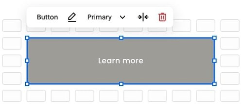
Button set to FIT

There you have it! How to edit your button design in Squarespace 7.1. We love the simplicity of editing buttons in Squarespace and all of the new creative design options!
If you want to learn more about designing in Squarespace, check out these posts:
How to create a Transparent Header Navigation in Squarespace (7.1 and Brine)
How to customize your mobile design in Squarespace 7.1 with the new Fluid Engine Editor
How to create a vertical line in Squarespace (7.0 & 7.1)
How to create rounded corners and unique shapes for your images in Squarespace (no coding!)
How to add a button to your header navigation in Squarespace
If you liked this post, Pin it to Pinterest! 👇🏻
