

How to Customize Your Mobile Design in Squarespace 7.1 With the New Fluid Engine Editor
In this post we're going to learn how to use the new mobile editor in Squarespace 7.1 Fluid Engine.
With the launch of the new Fluid Engine for Squarespace came an amazing new independent mobile editor. Squarespace's older Classic Editor automatically adapted existing desktop designs for mobile screens and while this was convenient, it was also really restrictive because you couldn't control the way your mobile site looked.
There are so many people browsing websites on their phones that mobile design is just as important, if not more important, than your desktop site these days.
So now, the Squarespace 7.1 Fluid Engine mobile editor is almost completely separate from desktop, meaning that you can move everything independently for mobile, and it doesn't affect your desktop site.
This definitely requires a bit of extra work, because you're almost designing two different designs per page or per section. But in this day and age with the importance of both desktop and mobile views, this kind of editing is necessary.
If you’ve never used Squarespace 7.1 Fluid Engine editor, we highly recommend you check out our last video which was all about how to use the desktop page editor. If you learn the fundamentals of this first, you're going to find mobile editing so much easier!
As we’ve already created a whole tutorial on the fundamentals of using Squarespace 7.1 Fluid Engine and our best tips and best practices for designing in Fluid Engine, this post is going to be pretty short, but here we go!

Is Mobile Editing in 7.1 Fluid Engine Extra Work?
We want to address mobile editing because what's new about Fluid Engine is the fact that we can edit our mobile site independently from our desktop.
Now, this seems to be a bit of a controversial point. We know some of you are really reluctant to do two sets of edits, one for desktop and one for mobile.
But actually, it's really not that hard. And if you want to just keep it super simple, you can! And we show you how in the video above 👆
BUT - You do need to check your mobile site every time you design a page or a section and just make sure it looks good. Which, you should have been doing anyway, really!
You don't have to do anything too advanced. You don't have to add new blocks or rearrange things too much. You might need to tweak a couple of things here and there, and realistically, this might take you a few minutes per section.
But the great thing is, if you want to do something more advanced, you now have the option! And we personally would, because we think optimizing for mobile, and making things look good on mobile is JUST as important as desktop these days.
👉 Hacks to make mobile editing in Squarespace Fluid Engine faster
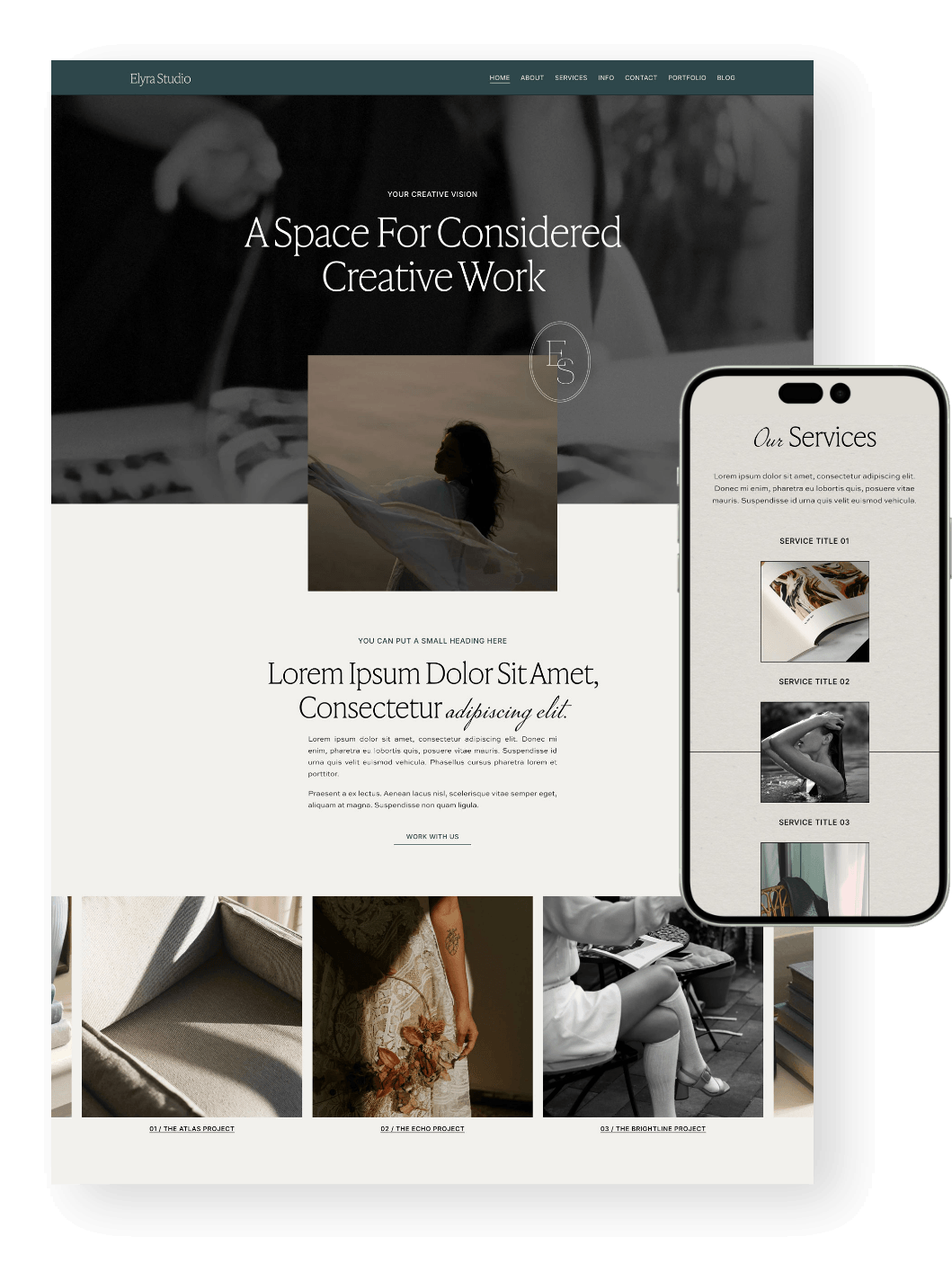
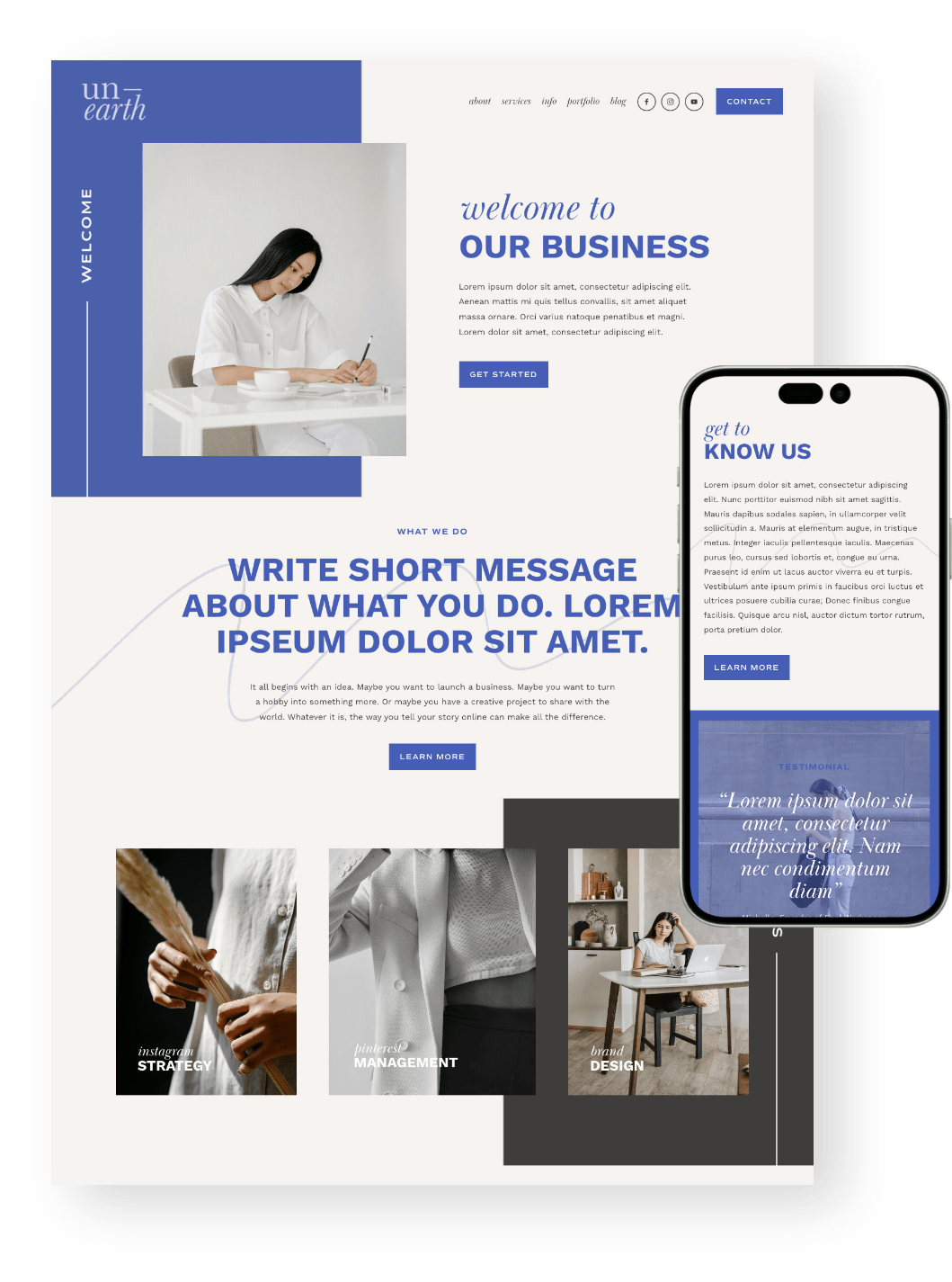
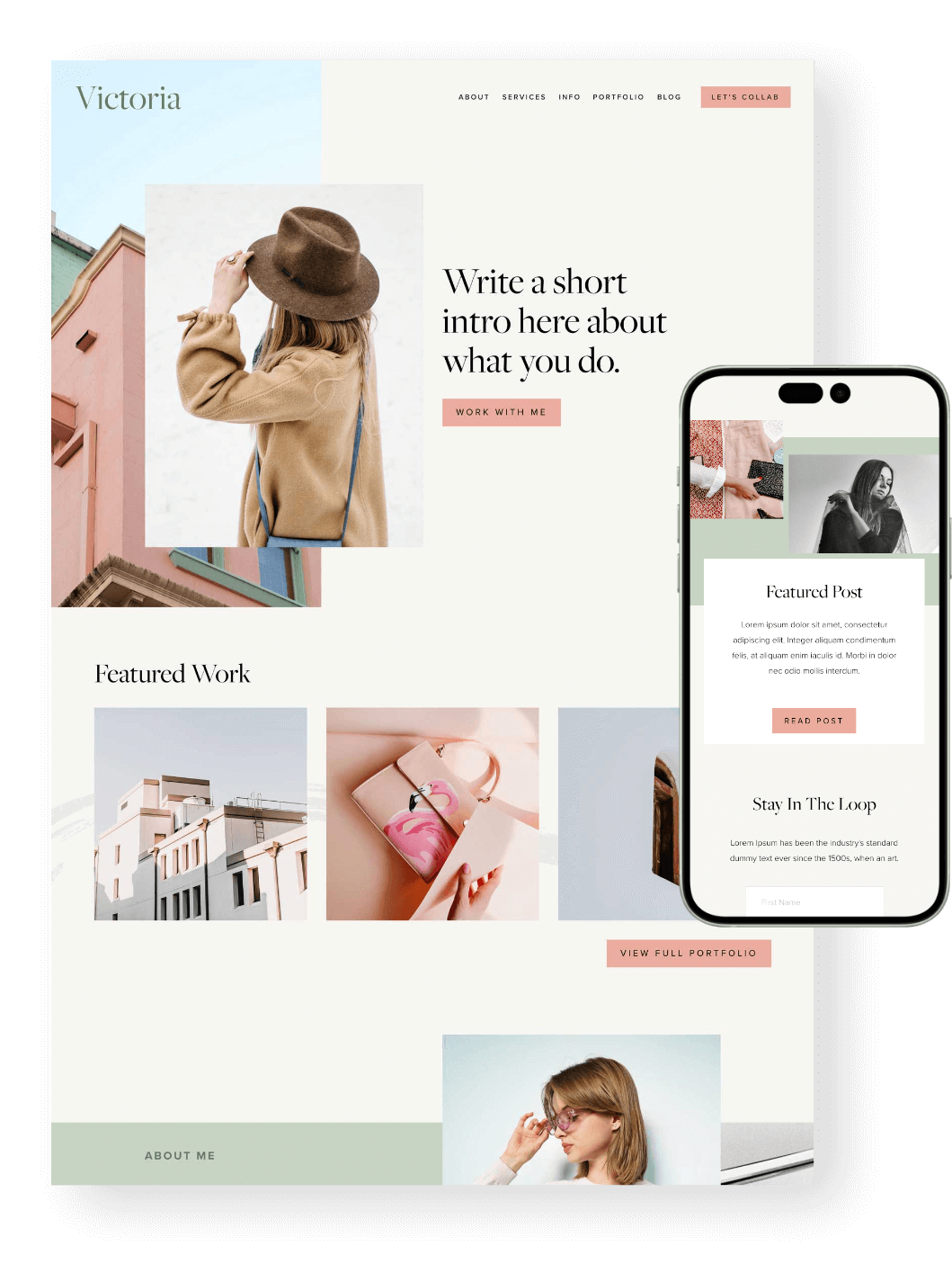
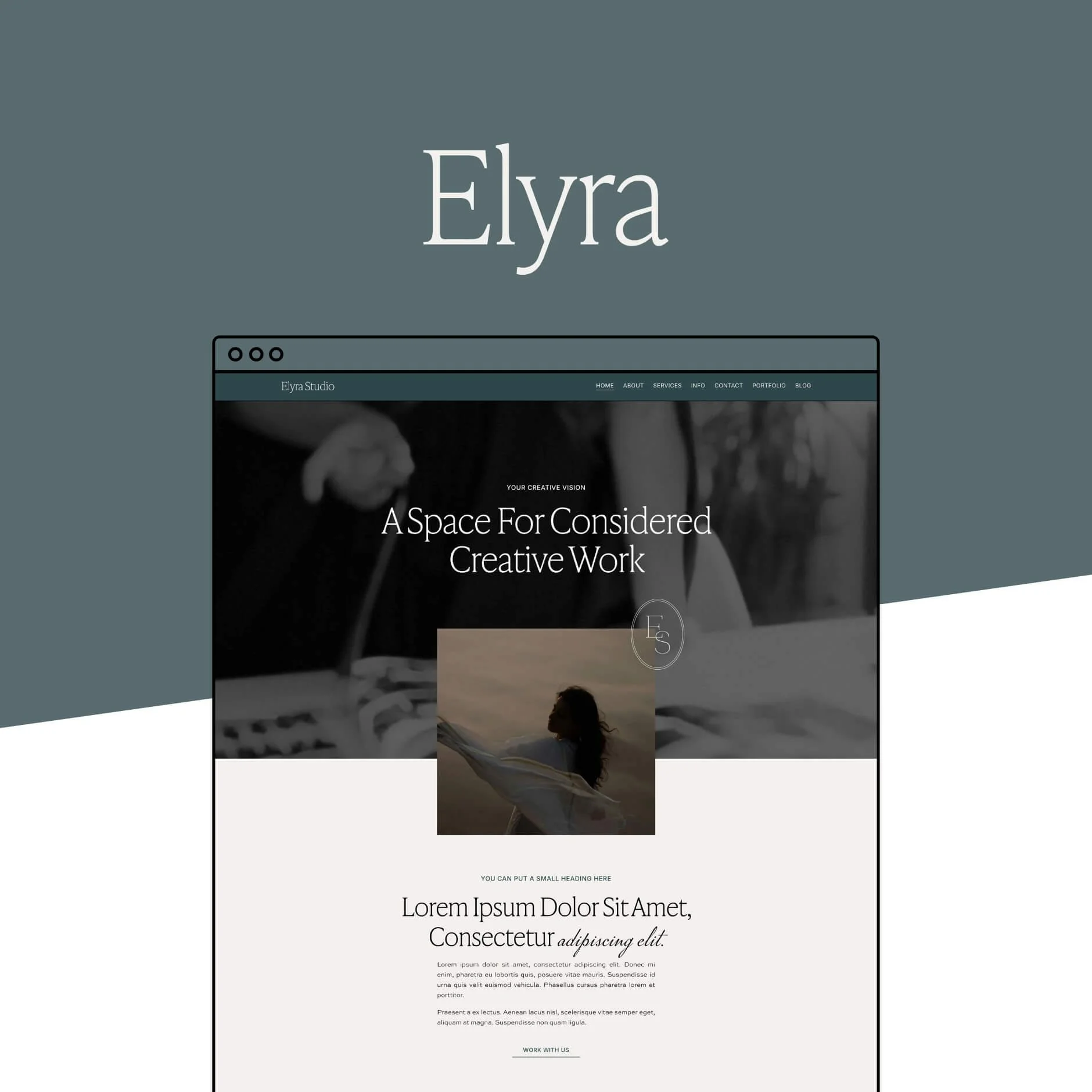
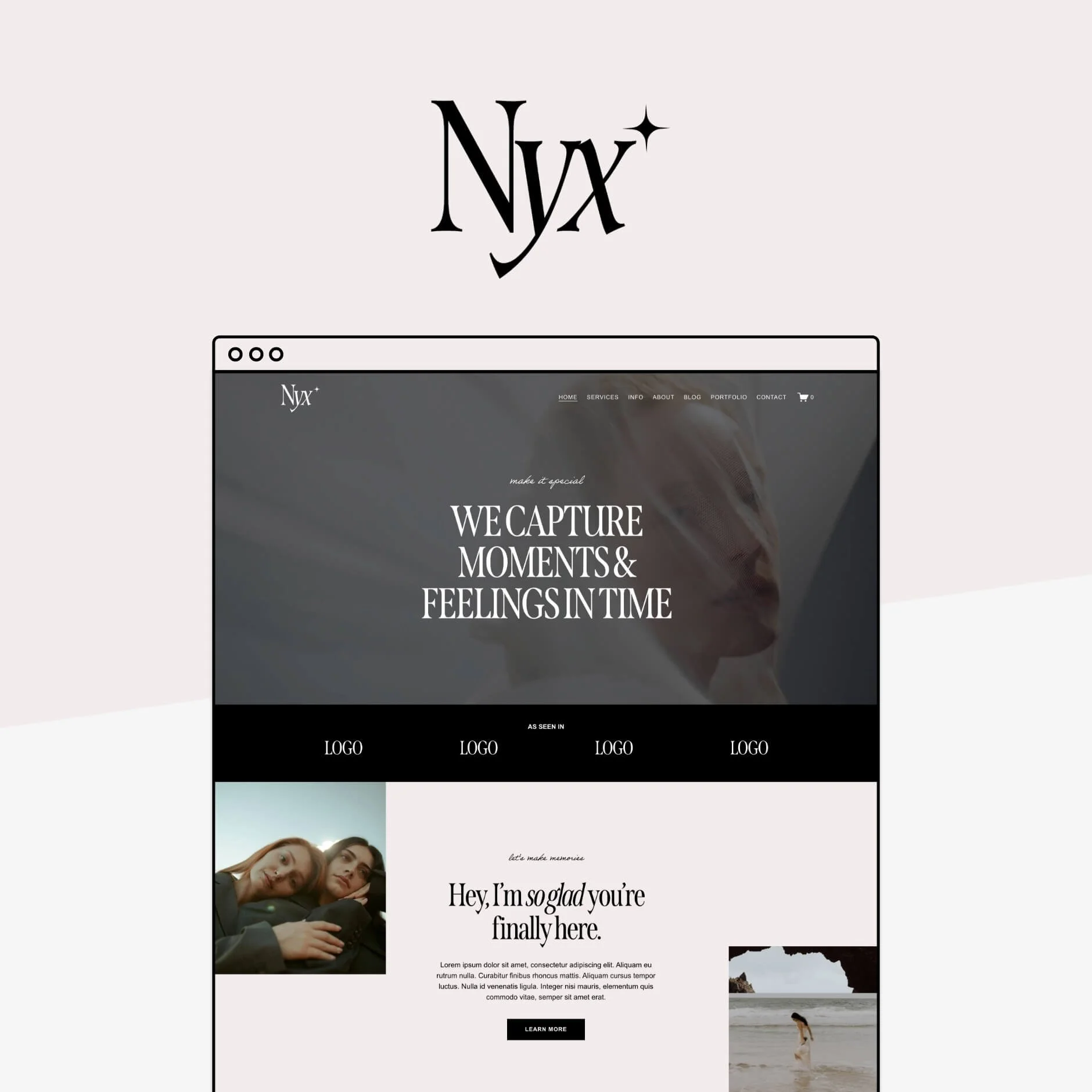
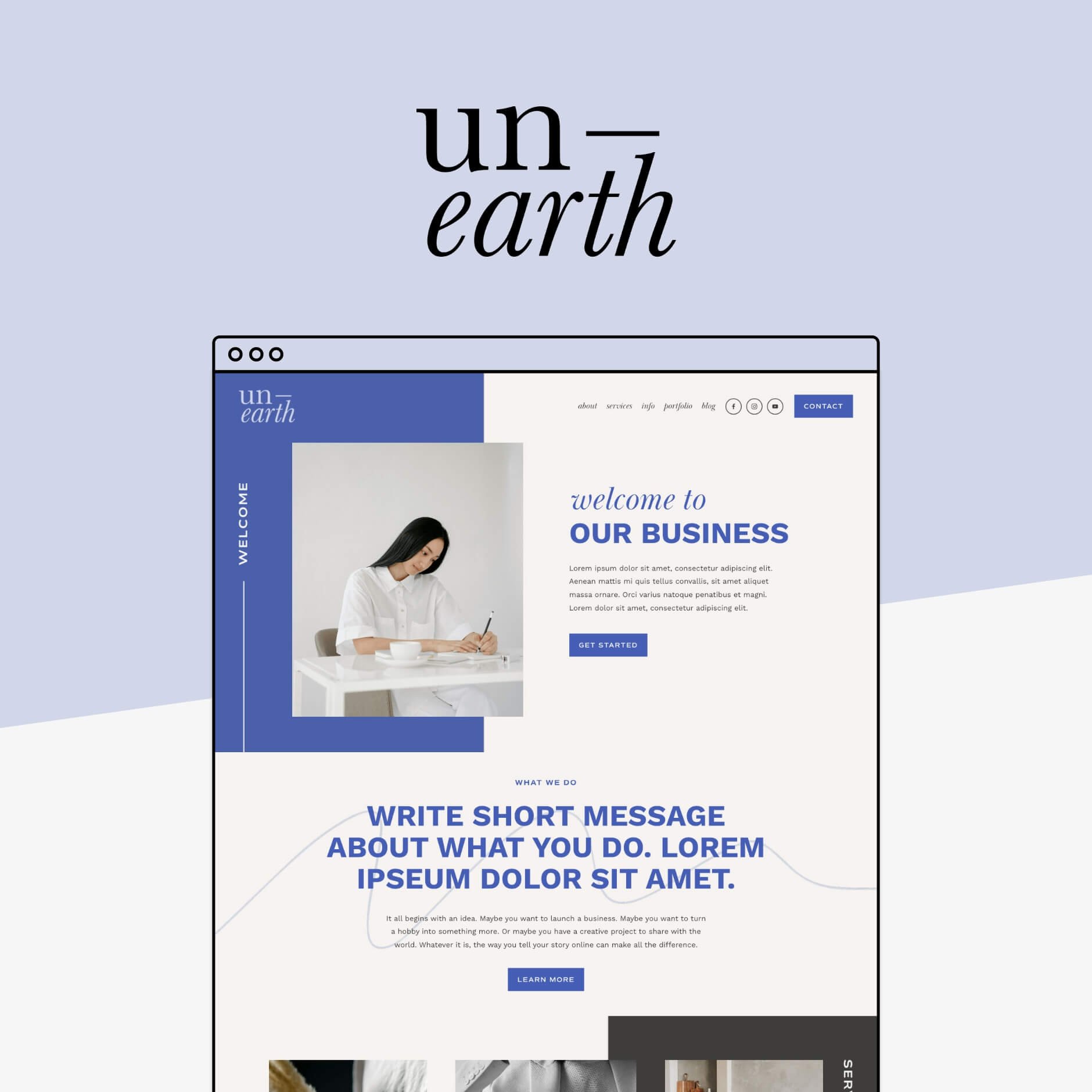
Want a Squarespace Template That's Already Mobile and Conversion Optimized?
All of our Squarespace templates are designed to be scroll-worthy on every screen. Smooth layouts, easy-to-tap buttons, and clear calls-to-action make your site just as powerful on mobile as it is on desktop.
So no pinching, zooming, or awkward formatting. Just a site that looks good (and converts) anywhere your audience finds you, and all done for you!
Check out our range below 👇


How to Edit for Mobile in Fluid Engine
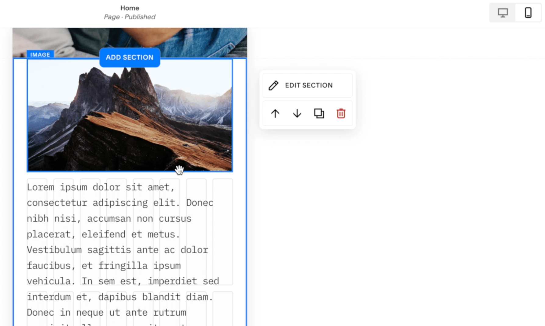
Just click EDIT on your page like normal.
Click on the Mobile icon in the top right, and your screen will adapt to mobile design.
Tip! Click on the G on your keyboard to bring up the Grid layout.

In the previous Fluid Engine Tutorial video, we went through all of the important Block settings, how to position things in the Grid, and the best practices for doing so.
Today, we’re talking about mobile, but, all of those desktop editing functions apply exactly to mobile too. Essentially, the mobile editor uses the exact same editing function as desktop. It's just in a mobile size! So you don't have to relearn anything once you know how to edit on the desktop.
Obviously, things are a lot smaller on mobile and the screen size is completely different, but this is why it’s important to adjust and make sure everything looks good on mobile too.
That's always been the case, but now we can actually do it independently.
How do my Mobile Sections Adapt?
Let's talk about how our sections automatically adapt.
Previously, in the Classic editor, the mobile site adapted depending on where things were positioned on desktop. This sounds good in theory, but actually it meant that a lot of the time when you were creating advanced, beautiful layouts on desktop, things would look pretty wacky on mobile, and you actually couldn't change that.
Now, in Fluid Engine, we have this whole separate editor and the way it automatically adapts for mobile, is that the blocks are in order of when we added them on our desktop site. Not in the order they are displayed on the desktop site.
At first, this might seem a little bit strange. But actually, it makes sense. If you have a completely separate design on mobile and you want it to be completely independent from desktop, there's no real right way to add the blocks to mobile. It's helpful, by at least adding the same blocks from desktop to mobile as you add them. Then it’s up to you to rearrange them.
Squarespace will stack the Blocks in the order that you added them, and this will involve a bit of rearranging, but it doesn't have to involve much rearranging.
So if you want to keep it simple, honestly, you could just leave them stacked! Stacked is pretty similar to how it would have been in the Classic Editor.
Or you could make a couple of tiny tweaks to make things more elevated for mobile – this is up to you, but it should only take a few seconds. Now, of course, it's going to take longer if you want to do something very advanced – but at least you have the option!
What Parts are Independent?
Positioning Blocks
The biggest thing that's independent is that you can position the blocks differently. You can move the position of any block in the Grid on mobile and it won’t change any block positioning on desktop, and vice versa.
Row Count
The other thing that is independent is the row count. We talked about the row count in the last video and how you can adjust this to make your section bigger or smaller. Your section row count is completely separate between mobile and desktop.
Just these two things open up a whole lot of design possibilities for mobile, but there are some things to look out for that actually aren't independent that you might assume are…
What Isn’t Independent?
Text Alignment
One of the biggest things that we really hope they change is text alignment.
For example, if you really want your text block to be centre aligned on mobile, but left aligned on desktop, this currently isn’t possible.
Best practices for Mobile Fluid Engine design
1 - Only Extend Images or Graphics Past the Grid
You can actually extend images and any blocks past the grid to be flush with the edges of your mobile site.
This can look really, really cool with images or graphics that you're trying to purposefully pull to the edge.
But when it comes to text, we really don't recommend doing this because you're going to have text butted right up to the edge of your mobile and it's just going to be really hard to read and it's not going to adapt well for different mobile screen sizes.
We really only recommend pulling right out to the edge very purposefully, and doing so with images only.
2 - Intentional Overlapping
The next thing that we want you to be conscious of is overlapping Blocks intentionally. The Fluid Engine is exciting because we can now overlap Blocks.
Where things can get a little bit tricky is when you're overlapping things unintentionally or accidentally. In the last tutorial we talked about how Blocks have their own container and these containers can span basically to wherever you want to drag them.
But just know that if something is within a container, depending on the screen size, it will move anywhere within that set container.
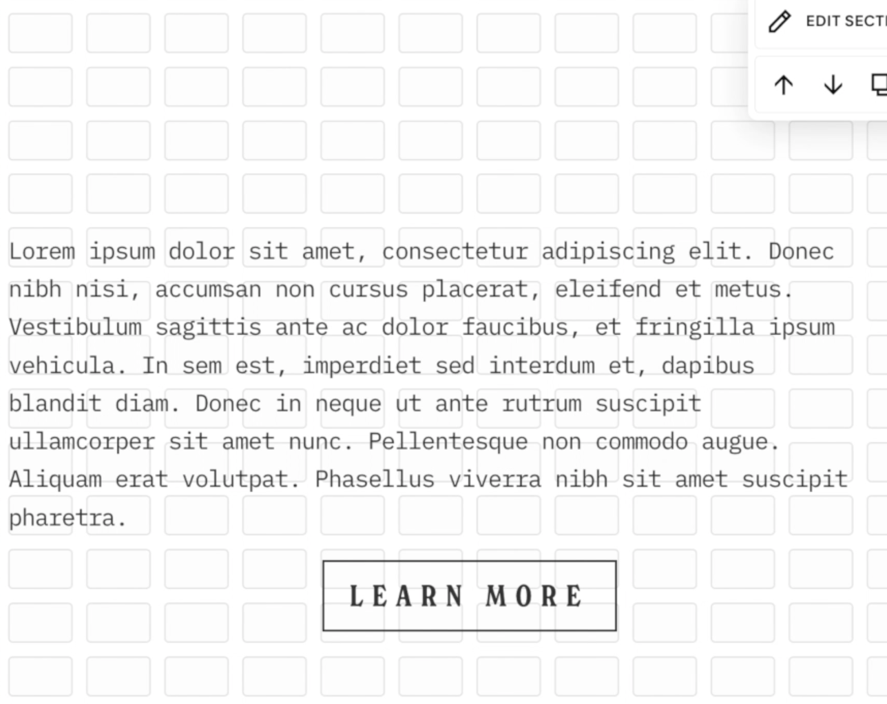
This example is from Desktop, but the same applies for Mobile:
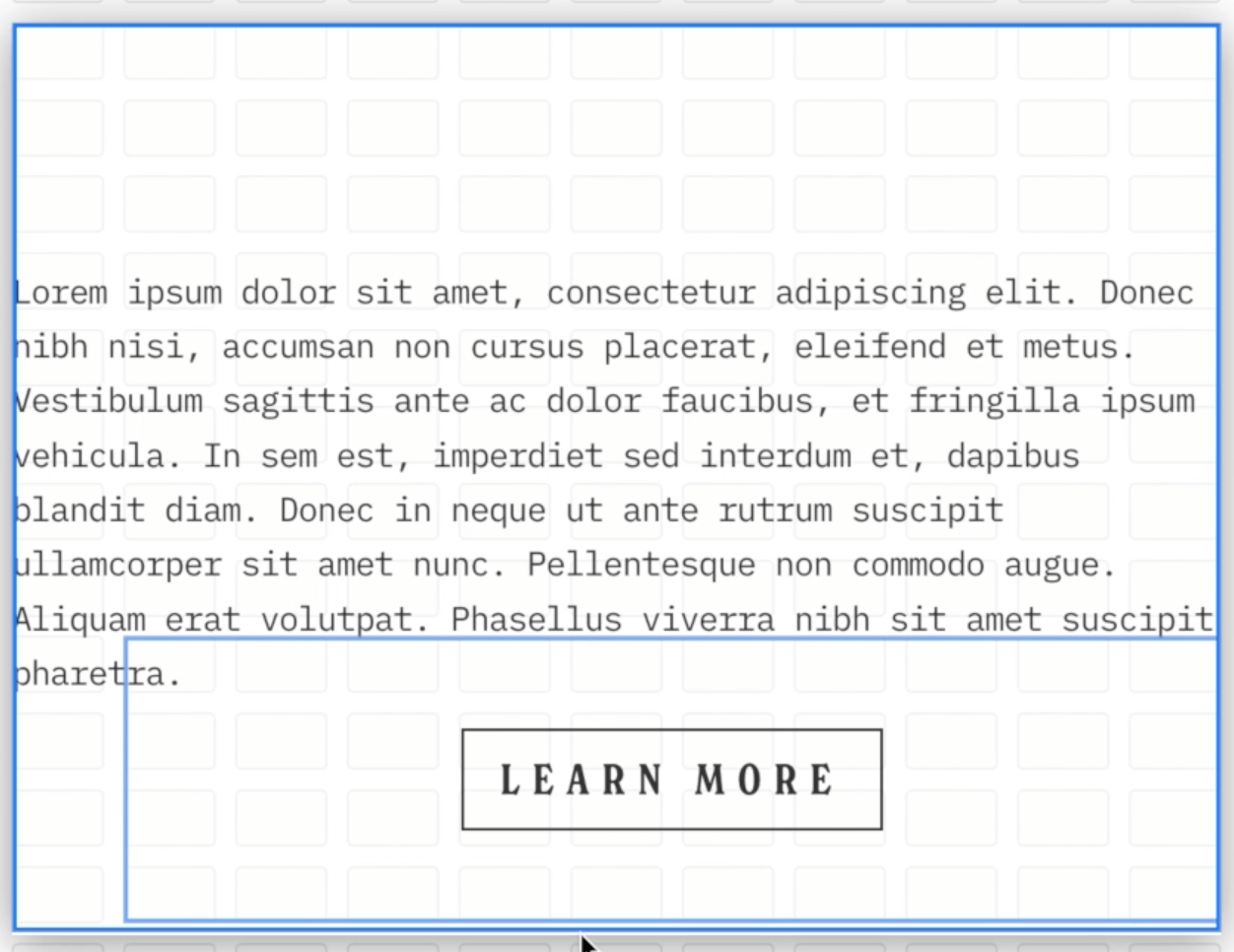
If we click out of the containers, the text and the button technically aren't touching or overlapping. But if we hover over these elements, you can see that the text container goes all the way below the button and the button container goes up into the text Block. The containers are overlapping:
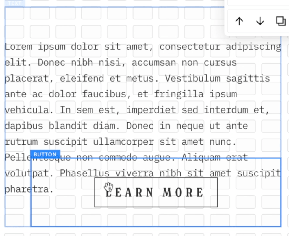
If we adjust the screen, we’ll eventually see that there's some overlap here that we weren’t intending on and that doesn't look very good. So if someone is looking on a mobile screen that is a different size than the Squarespace Mobile Preview (very common!) then something like this may happen.
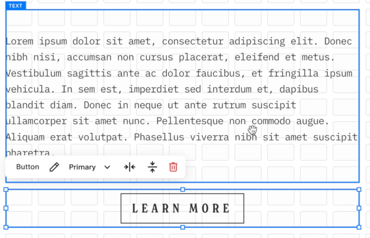
To avoid that unintentional overlap, just make sure that you haven't overlapped containers unless you've specifically meant to. This means dragging the Block Containers into their own Grid space so you can see there is no overlap of the containers:
This is quite easy to miss on mobile. Every time you do a Section, be very intentional about looking at your blocks and making sure that they've got their own room to breathe and they're not overlapping, unless of course the overlapping is intentional!
3 - Tidy up Extra Block and Section Spacing
You’ll probably also notice that when you are designing and moving things around in the Fluid Engine that Text Blocks (and the size of Sections) will change and adjust as you're editing. You might therefore need to come back and trim things up.
Text Block containers will often mysteriously expand and you'll need to drag them back to their intended size.
Sometimes you'll finish up your mobile section and you'll realize that you have all of this extra space at the bottom.
This is just something to keep in mind. Once you've finished your mobile section design, just remember to check and reduce your row count if needed.
What do you Think about Squarespace’s Fluid Engine Mobile Editor?
That's pretty much it for editing on mobile in the Fluid Engine. If you have a good understanding of how to edit on the desktop site, you're not going to have any issues in mobile because essentially, it's exactly the same.
Just keep an eye for those things that are independent and aren't independent. And when you have an idea of what those are, it does make it really easy to create some really cool things for mobile.
And again, I just wanna reiterate the fact that, even though you do have to check every section for mobile, you really should have been doing that anyway on Squarespace, because that is best practice!
If you want to keep it really simple, just let those blocks stack. If anything's in the wrong order, all you need to do is just quickly rearrange the order and you're good to go.
Squarespace 7.1 Fluid Engine Templates
Did you know that all of our Squarespace Templates for 7.1 are now compatible with Fluid Engine? Not only will you get a beautiful design to start with, but you’ll also get hours of our most up to date tutorials all about learning Squarespace and Fluid Engine.
Check out the templates below!


Explore more of our tutorials about mobile optimization below 👇
How to Change Mobile Logo on Squarespace
Mobile Optimization: Creating Responsive Squarespace Sites
How to Adjust Your Mobile Menu in Squarespace
How to center-align text in mobile ONLY in Squarespace
Hacks to make mobile editing in Squarespace Fluid Engine faster
If you liked this post, Pin it to Pinterest! 👇🏻
