

How to create full width sections in Squarespace 7.0 & 7.1
Squarespace makes creating modern and sleek websites easy. And when you think of a modern website, generally you think responsive pages with full-width images and backgrounds that break up the page into different sections.
Pages made up of full-width page sections is a look that’s been around for a while now, and is standing the test of time! It’s a great way to display your website.
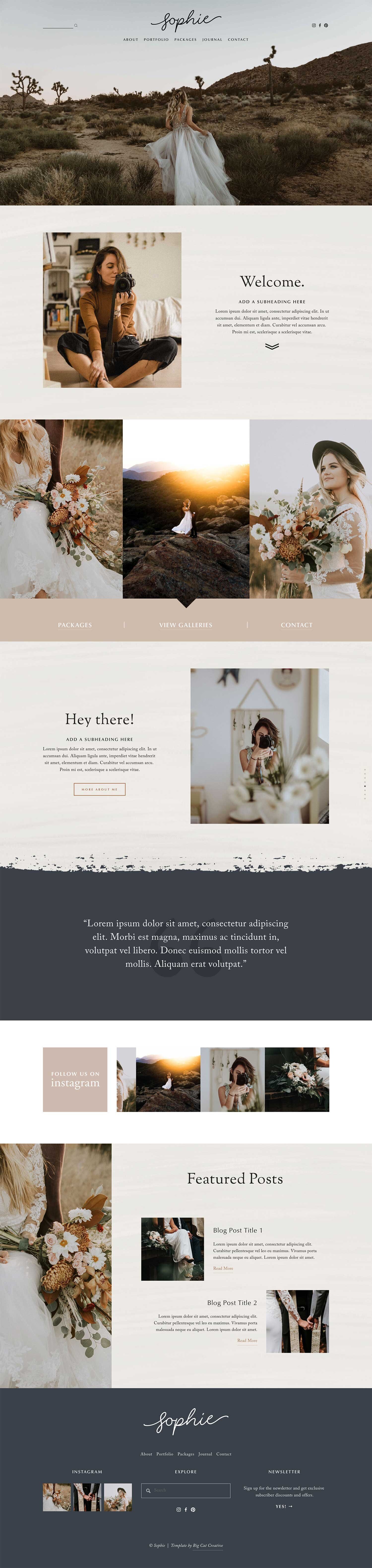
Below are some examples of web designs with full-width sections. Each of these designs has either full-width background images, slideshows, background colors or all three to break the page up into clear sections!
PS: You can browse all of these designs and more here in our template shop!


When I first started using Squarespace (7.0), I assumed that there would be a function to add full width “blocks”, since that’s really how you create anything in Squarespace, and was surprised when I found out that this didn't actually exist. But then how was everyone else on Squarespace doing it!?
Now Squarespace has a completely new version (Squarespace 7.1) and they make creating full-width sections ever EASIER.
Today I’m going to break down how to do it in both platforms! It’s super simple on both — no coding involved!
Sidenote: If you’re not sure about the difference between Squarespace 7.0 and 7.1, check out this overview I did here!
Full Width Sections in Squarespace 7.1
Creating full-width page sections just got a whole lot easier with Squarespace 7.1!
If you have ever used Squarespace 7.0 to create full-width pages by using Index pages, especially A LOT of them (like me), you probably know how darn tedious it can be. While the index page feature was great, it seemed like it could have been a lot simpler.
Enter Squarespace 7.1!
If you’ve never used 7.0 before and you’re starting fresh with 7.1, count yourself lucky on this front.
Squarespace 7.1 is basically built with the idea that everyone is going to want to create full width page sections (hooray) so they make it REALLY easy!
Also, this feature applies to any template, so you can start with ANY of the Squarespace 7.1 templates and the process is the same no-matter what.
How to do it
Step 1
First you will need to create a regular page. From your main menu, click Pages, click the + icon just like you would to add a regular page, then click Blank Page (You can use the Page Layouts too, these are basically just Blank Pages with some blocks already added to try to help you make the design process faster, but I prefer to start with Blank pages!)

Step 2
Then your page will look something like this. Click EDIT in the top left corner to edit on the page.

Step 3
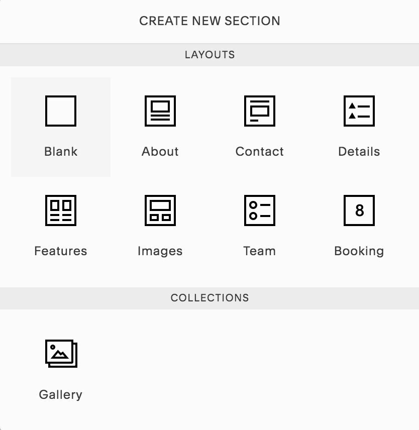
Click ADD PAGE SECTION, then choose a blank section! (Again, you can use and experiment the different Page Section options here!)

Step 4
Then you will have a new blank section on your page that looks something like this. You can edit all of the settings of this blank section by clicking on the little EDIT (pencil) icon here:

Then you can either upload a background image to the section, or choose a color theme from your color palette to set the background color. So simple!
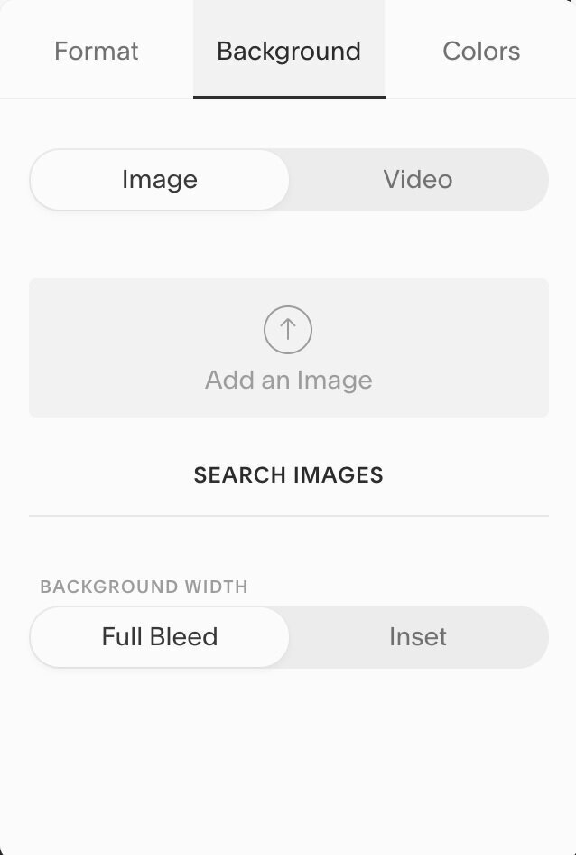

You can adjust these settings for every single section, and you can add as many sections as you need to to one page.
To add another section, just click on the blue + icon again!
Full Width Sections in Squarespace 7.0
First of all let’s just get back to some 7.0 basics:
Squarespace 7.0 has a lot of different templates to choose from and not all of these templates support full width sections. For this tutorial I’ll be working with the Brine family of templates (best family of templates ever, just FYI).
A “family” of templates means that they all have the same underlying structure and functionality, but each individual template starts with a slightly different design style. Technically, you could use any of the templates listed below and make them look exactly the same. Even though the design is different to start with, they all have the same technical features.
So, any of the following templates will work for this tutorial (woohoo!):
Brine, Aria, Basil, Burke, Cacao, Clay, Ethan, Fairfield, Feed, Foster, Greenwich, Hatch, Heights, Hunter, Hyde, Jaunt, Juke, Keene, Maple, Margot, Marta, Mentor, Mercer, Miller, Mojave, Moksha, Motto, Nueva, Polaris, Rally, Rover, Sofia, Sonny, Sonora, Thorne, Wav, West.
How to do it
Step 1
First you will need to create an “Index”. From your main menu, click Pages, click the + icon just like you would to add a regular page, then click Index.

Step 2
Once you’ve added an Index, you can add sections into the Index. The Index acts as the main singular page, each section within the Index will be each full-width section on the finished page. So click + Add Section under Index and choose Blank (or you can choose a page layout or Gallery, but blank is easiest to start with!)
Step 3
When you hover over your new Blank section, a cog symbol will appear. Click the cog on the page you want to edit, this will open up a pop-up panel. Click Media down the left side menu, then upload the image you want to be full width there! (It's called the banner/thumbnail) Once this has loaded, you’ll see that this has extended right to the edges of the screen.

Go ahead and edit these sections as you would any other page! Add headers and blocks and whatever you want, that’s the jist of it! Easy, right? From here you can experiment with all types of photos and sections. I use it in almost all of my designs and it can really help to achieve a range of styles.
Here’s some (important) EXTRA tips:
Under Design > Style Editor you can click Enable Parallax, this gives the images a moving while scrolling effect.
For just plain color-block sections, create a graphic that is just one color (easy right?). Just create a image in photoshop (or whatever program you use) that is any color you like, then upload it like you would any other image. You can get creative with this and have different colors or patterns. I suggest making your file between 1500-2000 pixels wide so that it is high enough resolution. You can also achieve this look with code, but this tip is if you want to keep it super simple.
Use high res images! I can’t stress this enough. Although it may look good on your small phone screen, when scaled up to a huge mac desktop, is it still going to look good? There’s nothing worse than seeing a whole bunch of low quality, pixelated images spread across a website (designer cringe!).
You need your images to be high res, but you don’t want them to be large (yes, there’s a difference!). If you've downloaded a bunch of professional beautiful stock images (kudos to you), chances are they're way too big. If the file size is too big, it will take a looong time to load. If your website takes too long to load, people go somewhere else, it’s a fact. I know I don’t hang around longer than about 5 seconds (max!). If a website is still loading after that amount of time, I’m out. It’s also really detrimental to your SEO, you will rank a lot higher if your site loads faster! Best practice is to have all images on your site under 500KB. You can do this in photoshop with the Save for Web feature, or you can use this free site that compresses images for you: compressjpeg.com. I’ve also written a more in-depth blog post about optimizing your images for Squarespace which you can read too!
Another thing to note is that if you have any text over your full-width sections, because they are overlaying over an image, they will change their color from your standard font colors to your “overlay” font colors. You can change this in the Style Editor, under where you set the colors for your standard font colors, e.g Heading 1 (Overlay). Adjust these after you’ve put some sections in and see how this affects the text colors over your background images.
I hope that helped! I’d love for you to share your awesome full width website designs with us over in our Instagram DMs!
Want more? Check out how to create a full width Instagram feed and more here 👇
How to create a full width Instagram feed in Squarespace 7.1
How to create a vertical line in Squarespace (7.0 & 7.1)
Creating an "as featured in" Logo Bar on Squarespace
How to add a button to your header navigation in Squarespace
How to add Parallax (banner animations) in Squarespace 7.1
Did you enjoy this post? Share the ❤️and Pin it to Pinterest!