

How to Make Your Squarespace Website More Accessible
Your website should look good, yes, but it should also be easy for people to actually use! That’s where website accessibility comes in.
Website accessibility is all about making your site easier for more people to navigate, read, understand, and interact with. And it's not just for those who need a little extra help from screen readers or assistive technology, it's also for people who might just be a little tired, squinty from the sun, or on a slow internet connection.
Making sure that your website is accessible might sound pretty daunting but the good news is that you really don't need to be a developer or expert to make meaningful improvements to your Squarespace website. A lot of accessibility basics come down to clear layouts, readable text, good contrast, and other simple tweaks that make a big difference to how easy your content is to move through. And bonus, improving your site's accessibility can also be really good for your SEO because search engines will also be able to understand your content better!
Before we dive into the nitty gritty of accessibility, a quick note that this blog post is here to give you general website accessibility tips, not legal advice. Accessibility requirements can vary depending on your location, business type, industry, and standards such as WCAG or ADA requirements. For formal compliance advice, it’s always best to speak with an accessibility specialist or legal professional!
Now, let's dive in!
Use a Clear Website Layout
One of the best things you can do for accessibility is make sure that your website is easy to understand at a glance. That doesn’t mean your site has to be boring. It just means your visitors should be able to very quickly figure out:
What you do
How you can help
Whether you're a good fit
How to buy, book, enquire, or take the next step
What information matters most
A clear layout helps people move through your website without feeling lost or overwhelmed and might involve simple tweaks like keeping your navigation simple, your sections organized, and your calls-to-action easy to find.
A good tip is to not cram too many buttons, images, headings, links, or competing messages into one section. Instead, break up each section on your site so that each one has a clear job!
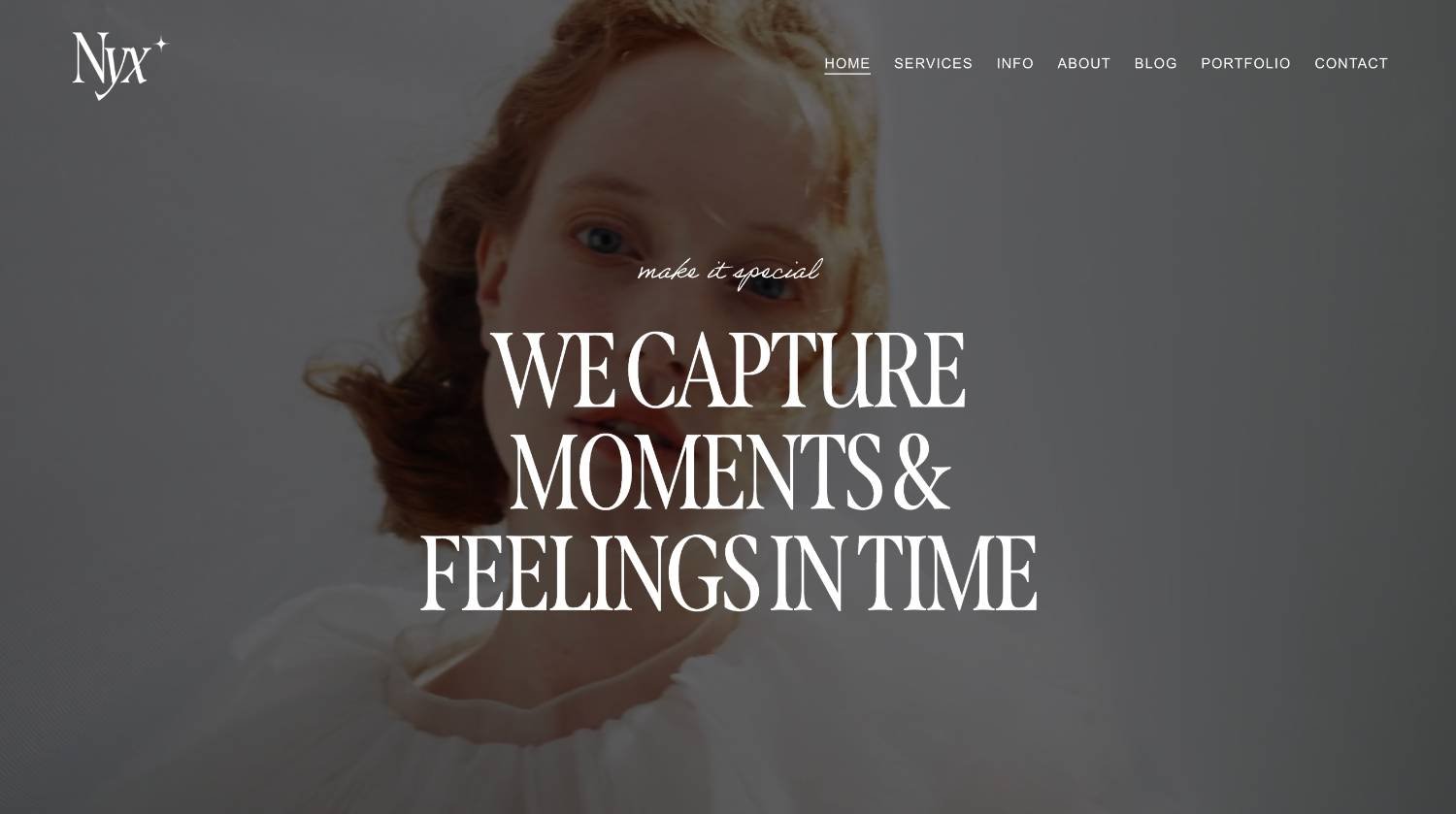
For example, a hero section might introduce what you do and guide visitors to your main call-to-action.
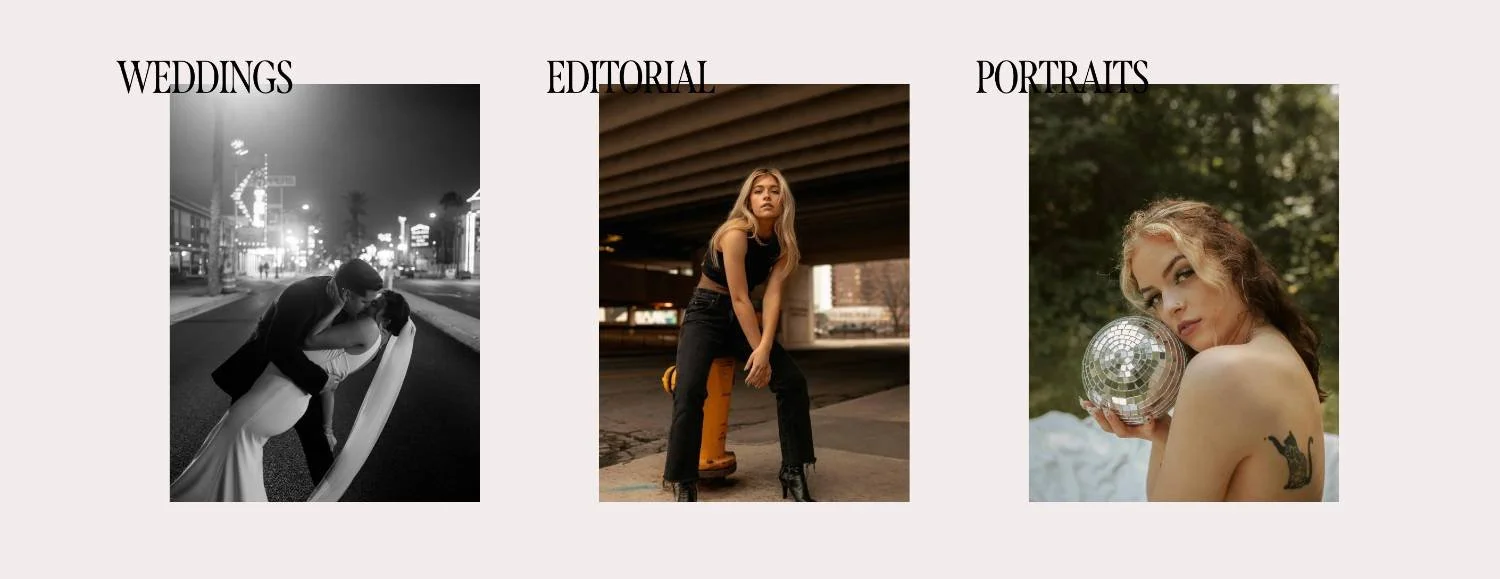
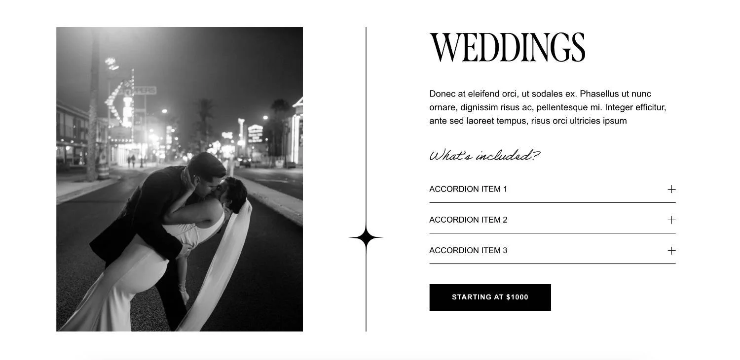
A services section might help people compare your offers.
A testimonial section might build trust.

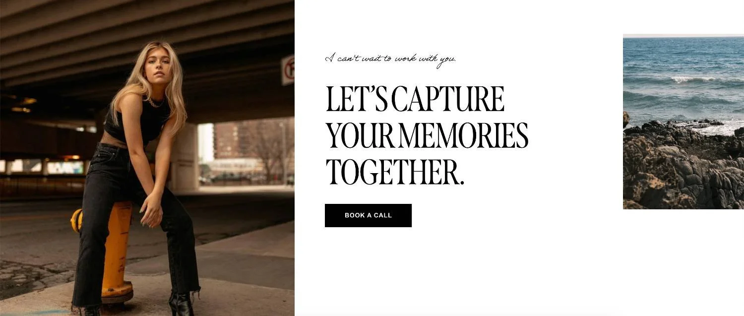
A contact section should make it very easy to get in touch.
When you’re editing your Squarespace site, especially in Fluid Engine, also be careful with overlapping blocks. It can be tempting to layer text, buttons, and images for a more custom look, but overlapping blocks can sometimes make content harder to read or interact with, especially on mobile!
👉 Mobile Optimization: Creating Responsive Squarespace Sites
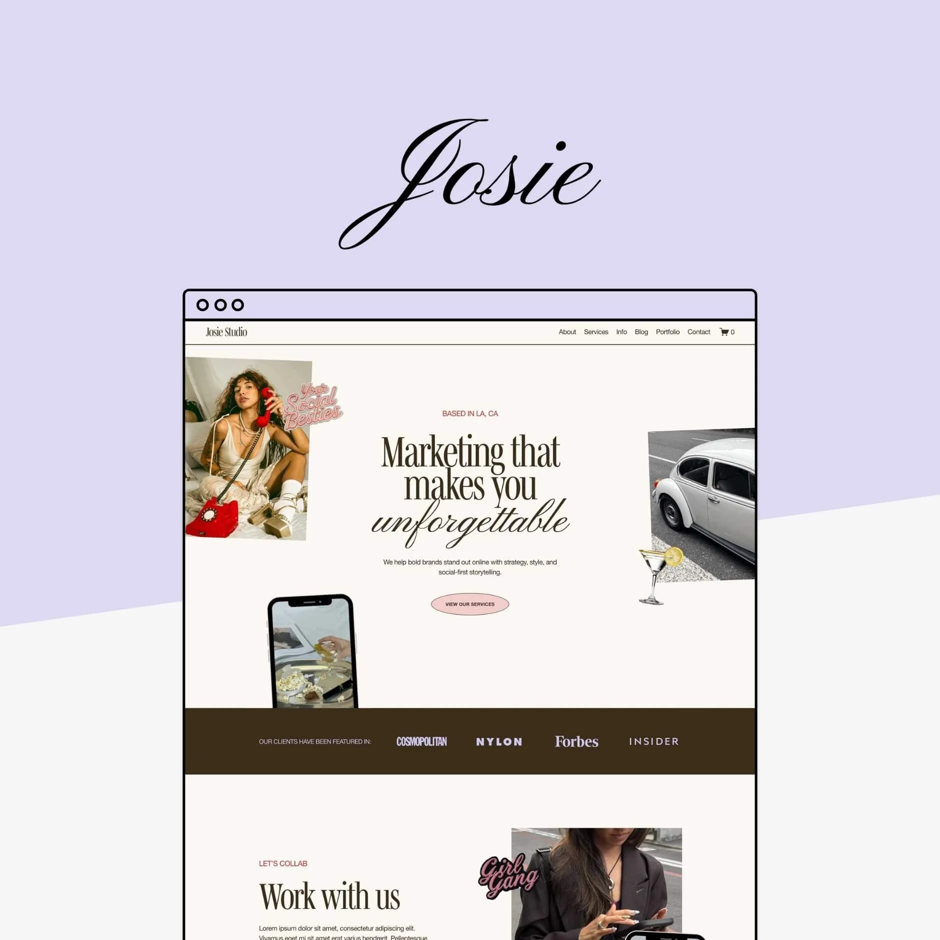
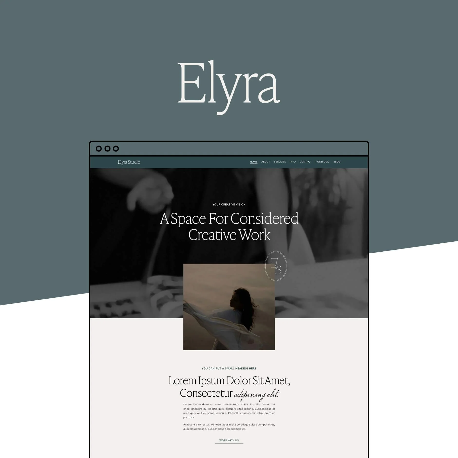
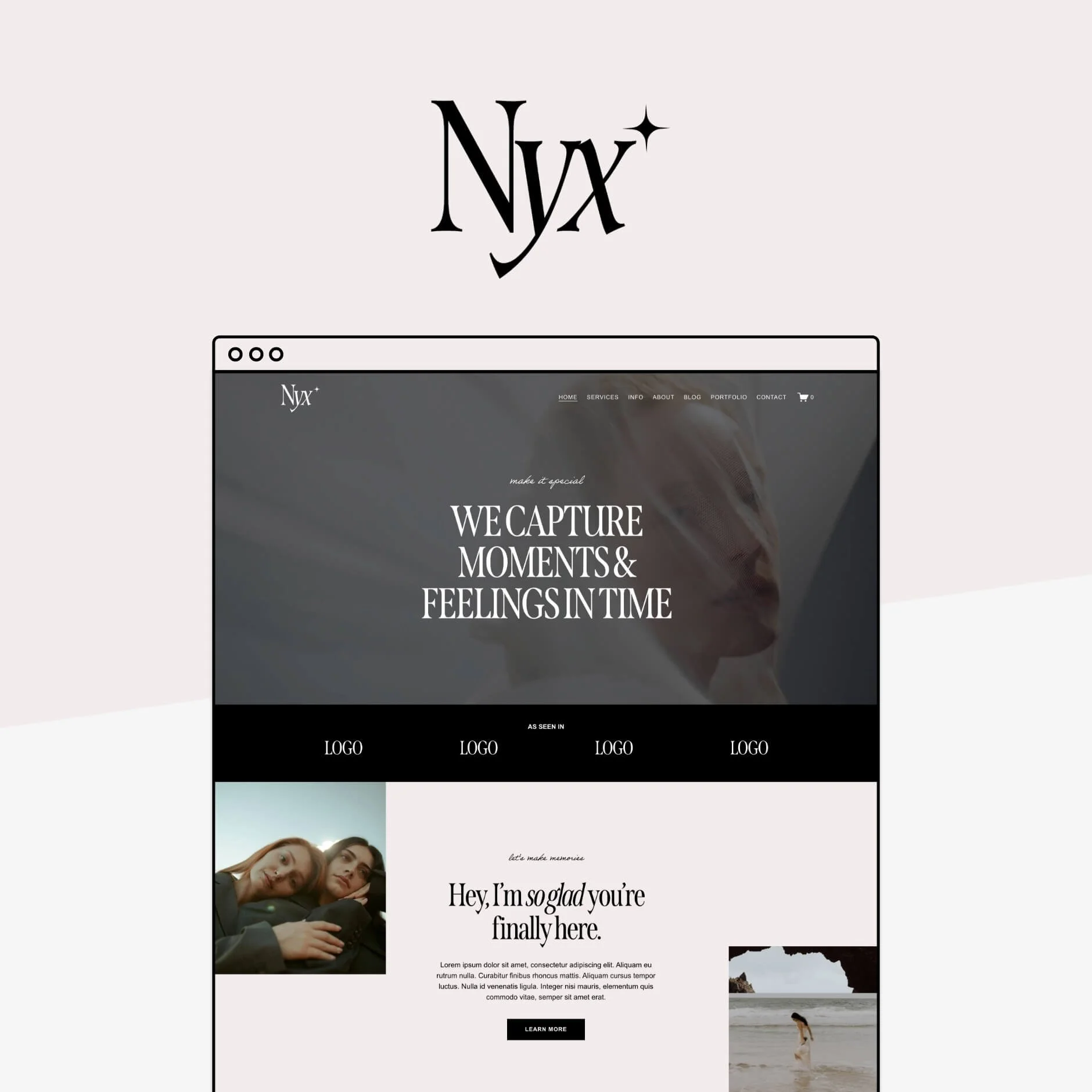
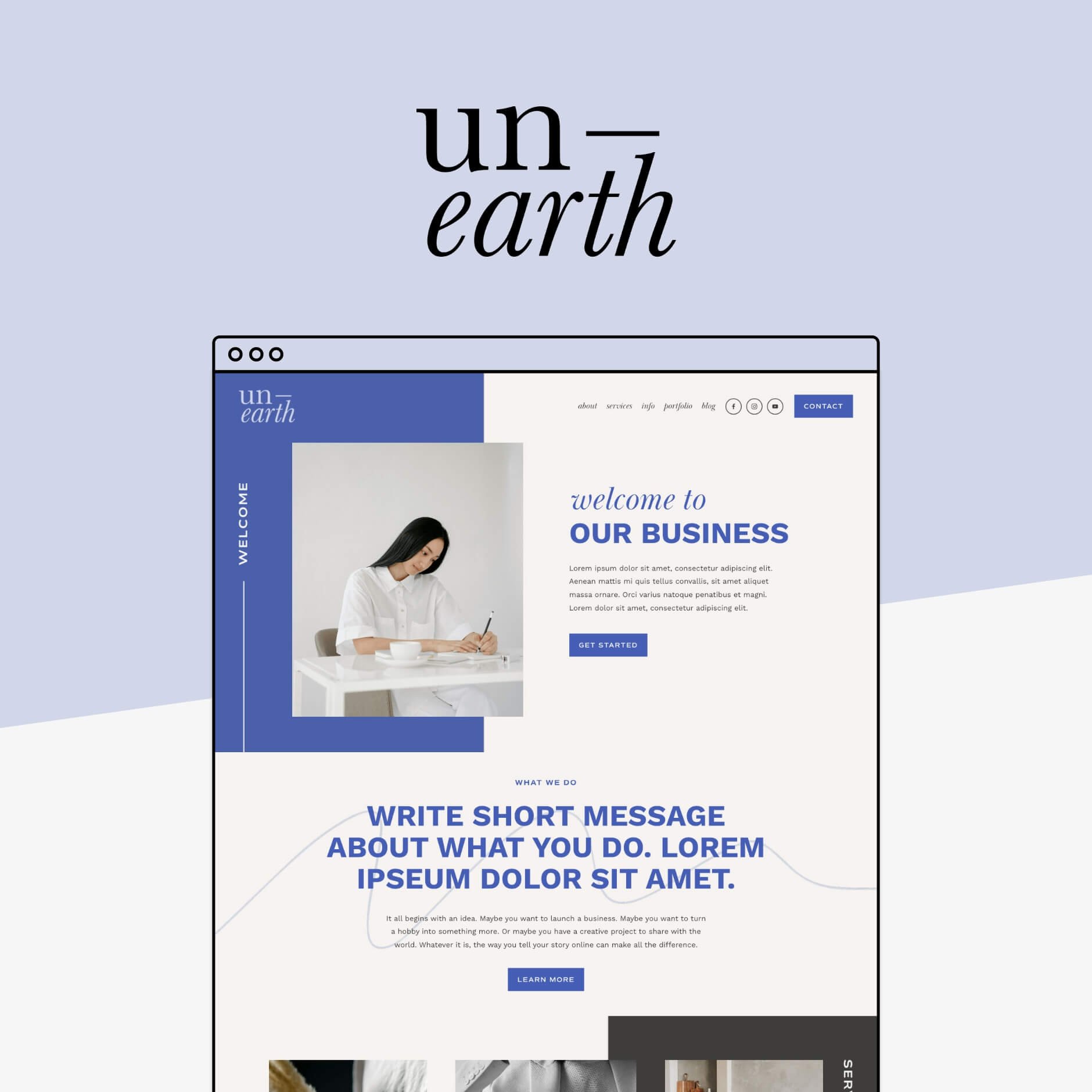
If you're feeling a bit lost with how to make your website layout clearer, a good option is to start with a pre-designed website template!
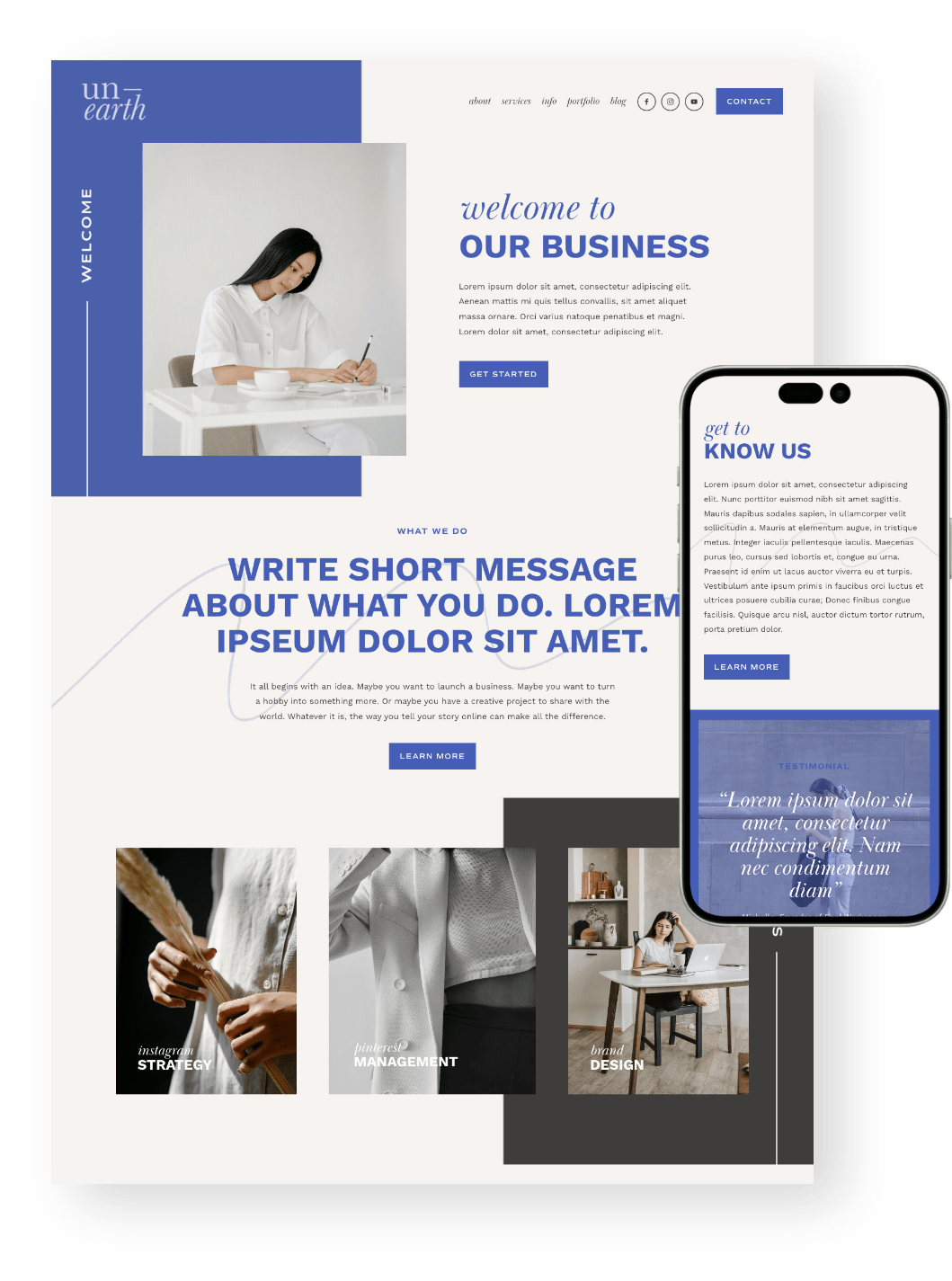
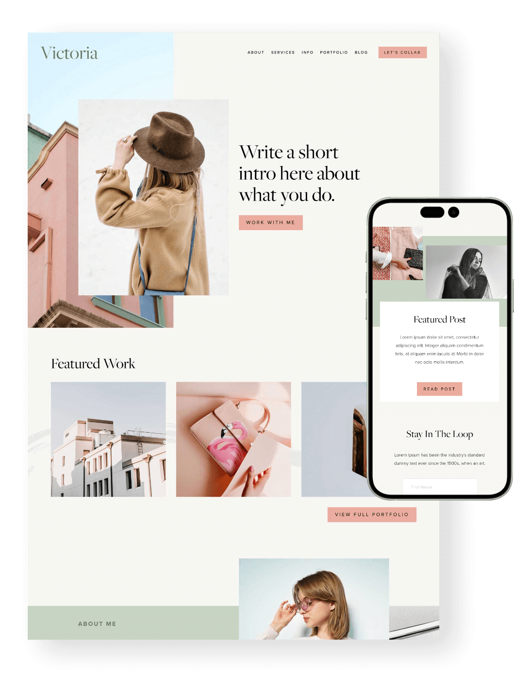
Browse our Squarespace templates and start with a layout that’s already designed to be clear, strategic, and easy to use:


Structure Your Pages With Proper Headings
Headings are not just there to make text look pretty:
They help organize your page.
They help readers skim and quickly find the information they are most interested in.
They help search engines understand your content.
And they help screen readers interpret the structure of your page.
A good heading structure works a bit like an outline. Your page should always have (only) one main H1 heading broadly covering what the page is about, followed by H2 headings for major sections, then H3 and H4 headings for smaller points within those sections.
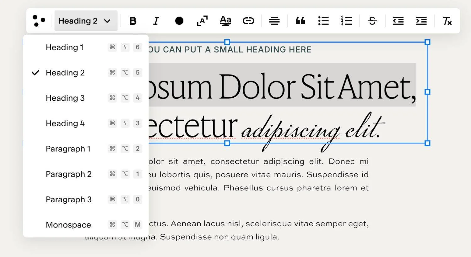
The mistake a lot of DIYers make is choosing headings based only on how they look. For example, using a Heading 1 style because it looks big and bold, even if it’s not actually the main title of the page!
Instead, choose headings based on structure first, then adjust the design settings in Squarespace to make them look the way you want.
👉 Choosing the Right Fonts for your Squarespace Site
👉 How to Upload a Custom Font to Squarespace (7.0 & 7.1)
A Simple Headings Checklist:
Use one clear H1 per page.
Use H2s for main sections.
Use H3s and H4s for sub-sections.
Don’t skip heading levels just for visual style.
Avoid using headings for decorative text that doesn’t add structure.
Include relevant keywords naturally where they make sense.
This is especially important for blog posts, service pages, sales pages, and long-form website pages that have lots of content that it's important to keep organized.
Write Clear, Easy-to-Read Content
Accessible content should be easy to read and easy to understand. That doesn’t mean you need to oversimplify your brand voice or strip out all personality. It just means your website copy should be clear, direct, but also helpful.
A lot of your website visitors will skim through your site before they read properly to quickly try to figure out whether they’re in the right place. If your content is one giant wall of text, they'll probably give up before they ever get to the good stuff!
Instead of long paragraphs, try to break up your content into smaller, more digestible pieces:
Keep paragraphs short.
Use clear, simple language.
Avoid unnecessary jargon.
Break up long sections with headings.
Use bullet points for lists or key details.
Put the most important information near the top of the page.
Make your calls-to-action clear and specific.
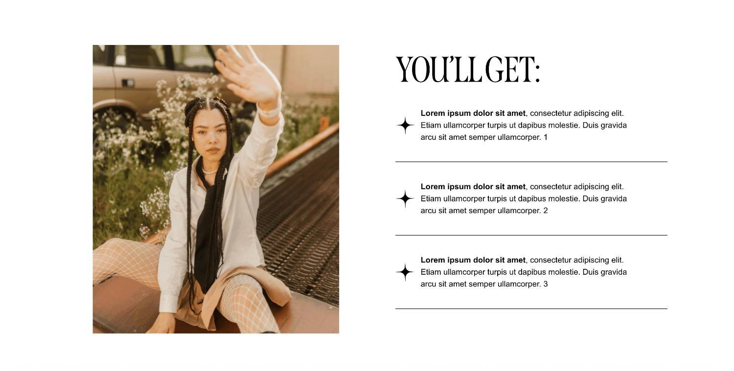
Make Your Links and Buttons Descriptive
Your links and buttons should make sense on their own.
That means avoiding vague phrases like:
Click here
Learn more
Read more
More info
Submit
These aren’t always terrible, but they’re not very descriptive, especially if someone is using a screen reader or skimming through links out of context.
Instead, try to make your link text more specific.
Instead of "Click here", try "View our Services"
Instead of "Book now", try "Book a consultation call"
This helps people understand what will happen when they click. It also gives search engines more context about the linked pages which is also better for your SEO.
Button Tips:
Use action-focused language.
Make buttons specific.
Keep button text short but clear.
Use the same CTA language consistently.
Make sure buttons stand out visually.
Avoid having too many different CTAs in one section.
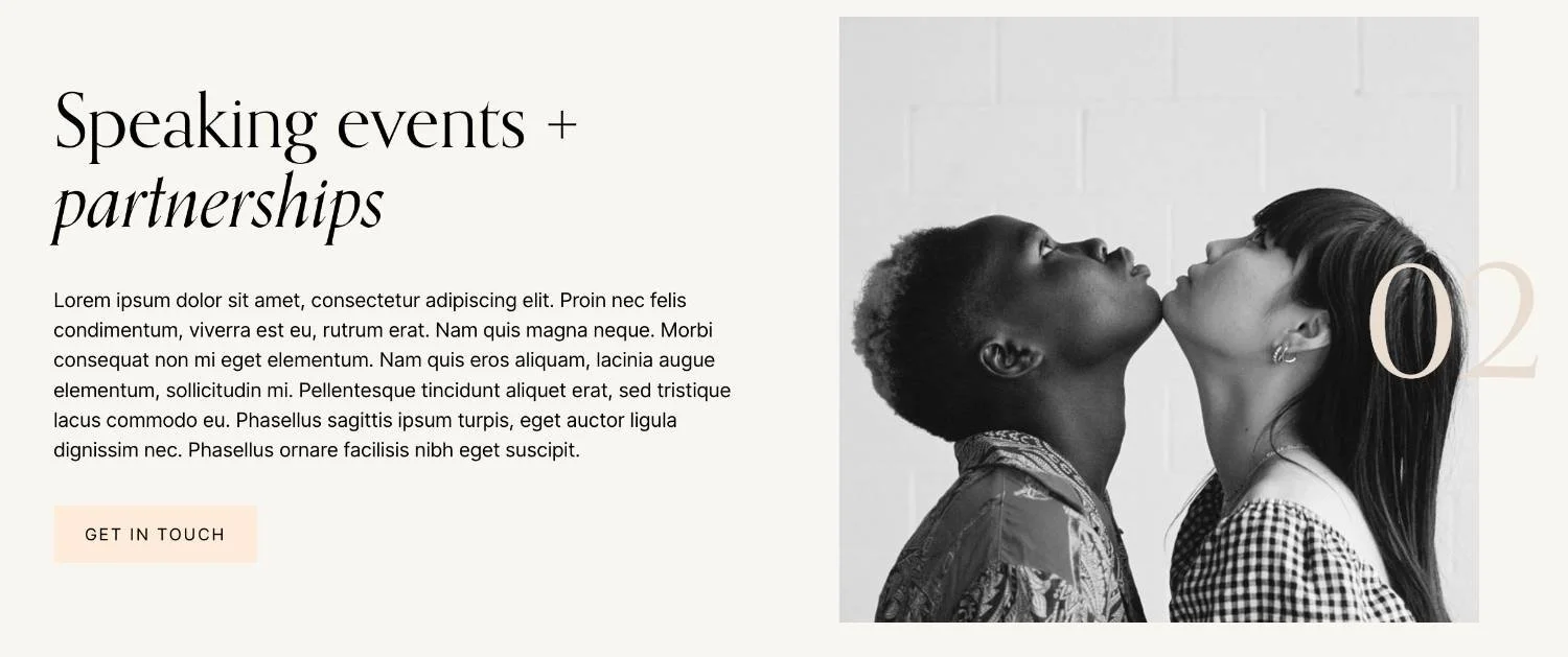
Don’t Hide Important Information Inside Images
This is a big one! Try not to put essential information only inside an image or graphic.
For example, if you create a beautiful Instagram-style graphic for your website that includes your pricing, event details, service inclusions, or important dates, make sure that same information also appears as real text on the page.
Why? Because text inside an image may not be readable by screen readers. It can also be hard to read on mobile, difficult to resize, and less useful for SEO.
Avoid Hiding Important Details Like:
Prices
Dates
Service inclusions
Booking instructions
Event details
Contact information
Testimonials
Product details
Menu items
FAQs
If an image does include important text, add the key information nearby in the body copy too. You can also describe the image with alt text, but for essential information, visible page text is usually the best option.
Add Alt Text to Your Images
Alt text is basically a short written description of an image. It's designed to help people using screen readers to understand what an image is showing but can also help search engines better understand your images which can help boost your overall SEO too.
Squarespace includes alt text fields in each image block's settings:
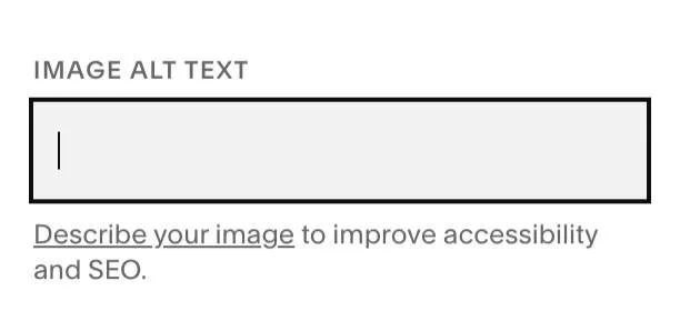
You can also use their built-in SEO/AIO panel to scan your site for images missing alt text and help you review or edit AI generated alt text suggestions.
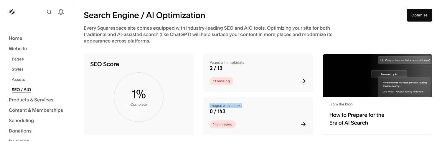
Effective alt text should be descriptive, helpful, usually around 150–160 characters long, and should avoid keyword stuffing. The goal is to describe the image in a way that is actually useful so ask yourself “how would I describe this image to someone who can’t see it?”.
Make Sure Your Text is Readable
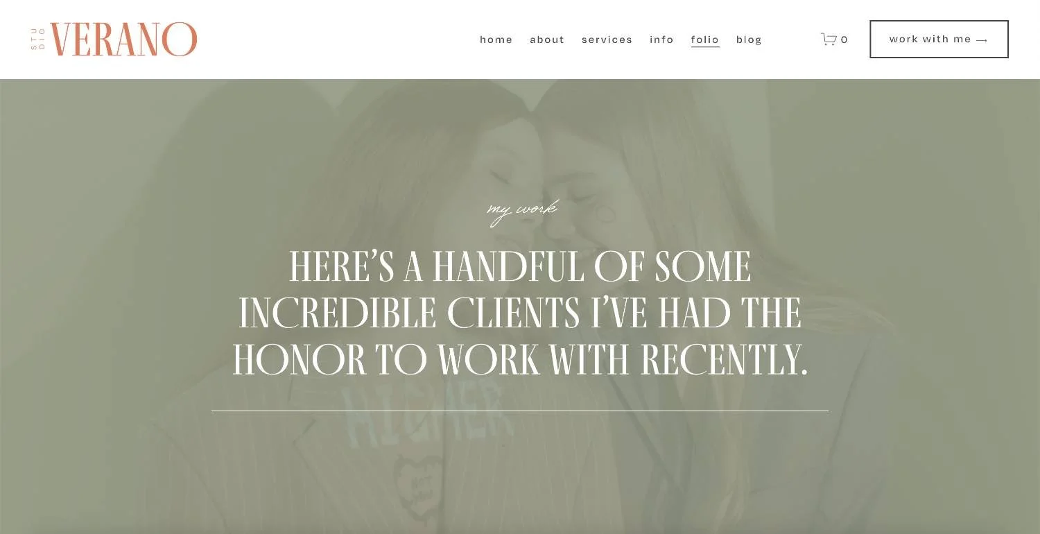
We know that script font you just found is gorgeous but decorative fonts should be used sparingly across your site as they can quickly become hard to read! Avoid using such fonts for paragraphs, instead, save them for small design moments and fun accents that inject personality into your site.

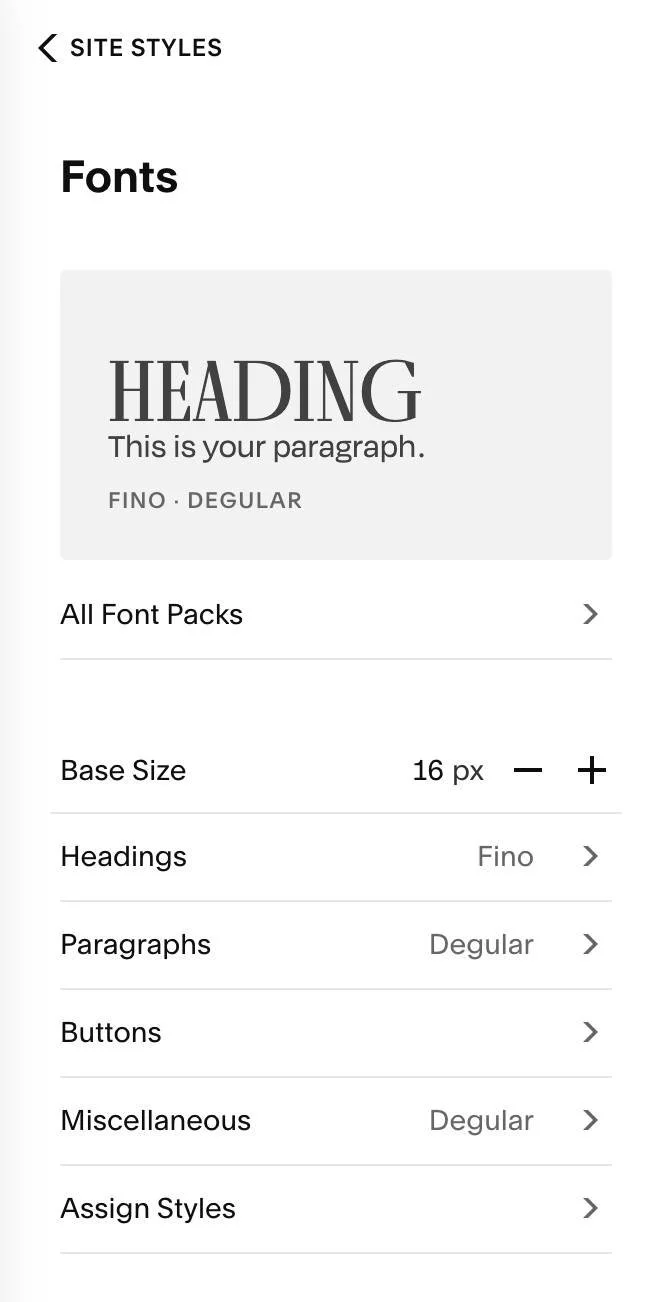
Font size matters too. Tiny text might look cute and dainty but it can make your content frustrating to read for many people. You can control the base font size and the size for each heading and paragraph style in your Squarespace website's Site Styles panel:
If you are using text over images, readability can be especially tricky. If your hero section has a busy background image with white text over the top, make sure the words are still easy to read. You may need to darken the image, add an overlay, use a solid or semi-transparent background behind the text, or move the text to a clearer part of the image.
Pretty is not enough if people have to squint!
Readability Tips for Your Squarespace Site:
Use a clear, readable font for body copy.
Avoid using script or decorative fonts for long paragraphs.
Make sure your font size is large enough on mobile.
Check your line height so text doesn’t feel cramped.
Use enough spacing between sections.
Avoid long lines of text that stretch too wide across the page.
Don’t place text over busy images unless there’s enough contrast.
Check Your Colour Contrast
Following on from the last point, it's also really important to check colour contrast across your site and refers to how clearly your text stands out from the background.
For example, black text on a white background has strong contrast. Pale beige text on a white background? Probably not so much.
Good contrast is important for people with low vision, colour blindness, or anyone viewing your website in less-than-perfect conditions (like on a phone, outside, on a super sunny day).
This doesn’t mean your website has to be black and white. You can absolutely still use soft, fun, bold, colourful, or brand-led palettes. You just need to make sure important text and buttons are easy to see.
Watch out for Combinations Like:
Pale grey text on white
Beige text on cream
Light pink text on white
Yellow text on white
Blue text on purple
Red text on pink
Thin white text over a bright image
Tip! You can use a free colour contrast checker, like the WebAIM Contrast Checker, to test your text and background colour combinations.
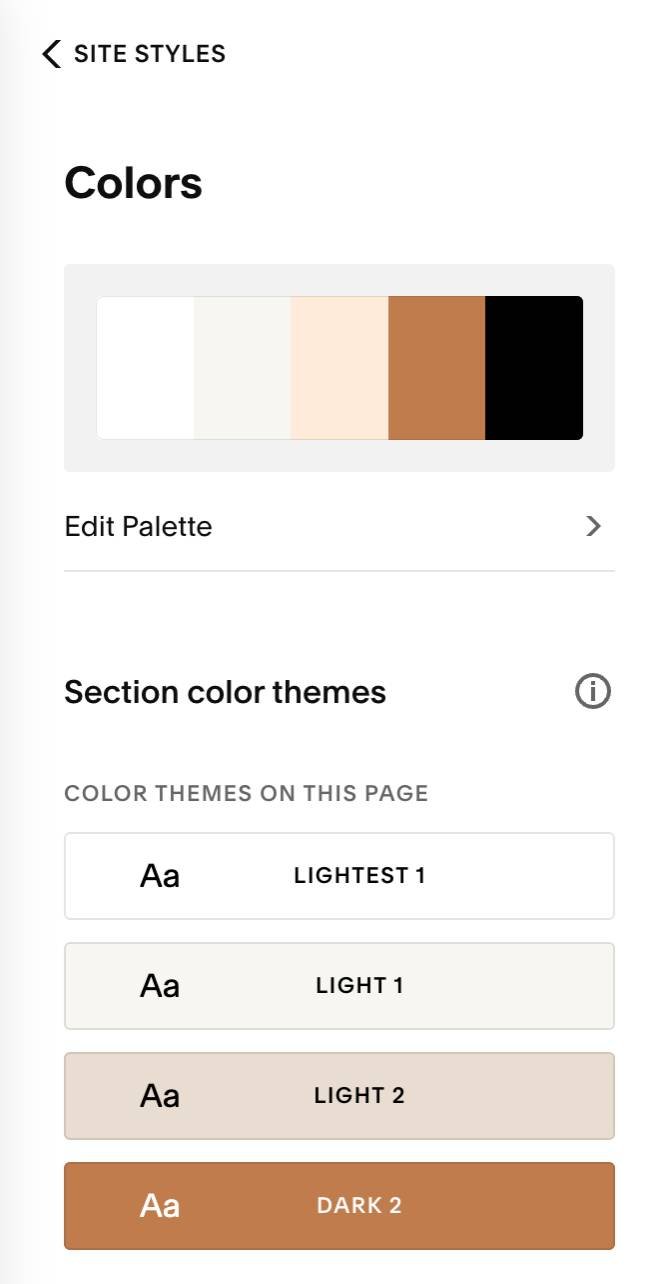
If you need to adjust any colors, you can head to your Site Styles panel and adjust the swatches in your colour themes:
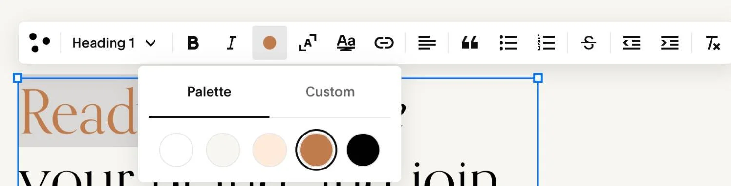
Or you can also adjust the color of any text blocks directly in the editor:
Make Videos, Audio, and Animations More Accessible
Videos, audio, and animations can make your website feel way more engaging, but they can also create accessibility issues if visitors can’t control them or access the information in another way.
If you use videos on your Squarespace site, add captions wherever possible. Captions help people who are deaf or hard of hearing, but they also help people who might be watching without sound. Think about how often people scroll websites while they’re in public, sitting near someone else, or trying not to blast audio from their phone. Captions are helpful for everyone!
If you use audio content, consider adding a transcript. This gives people another way to access the same information.
If you use animations, scrolling effects, slideshows, or autoplay videos, make sure they don’t distract from the content or make the site harder to use. Moving content can be difficult for some visitors, especially if it can’t be paused or stopped.
Accessibility-friendly Media Tips:
Add captions to videos.
Provide transcripts for audio where possible.
Avoid autoplaying audio.
Be careful with fast-moving animations.
Don’t use flashing content.
Make sure slideshows or videos have controls where possible.
Don’t rely on video alone to explain important information.
A little movement can add personality but too much movement can make your site harder to use!
Test Your Site With Keyboard Navigation
Some people navigate websites using only a keyboard instead of a mouse or trackpad.
A simple way to test this on your own website is to open your site and use the Tab key to move through links, buttons, forms, menus, and other interactive elements. Keyboard users commonly use Tab to move forward through interactive elements and Shift + Tab to move backward.
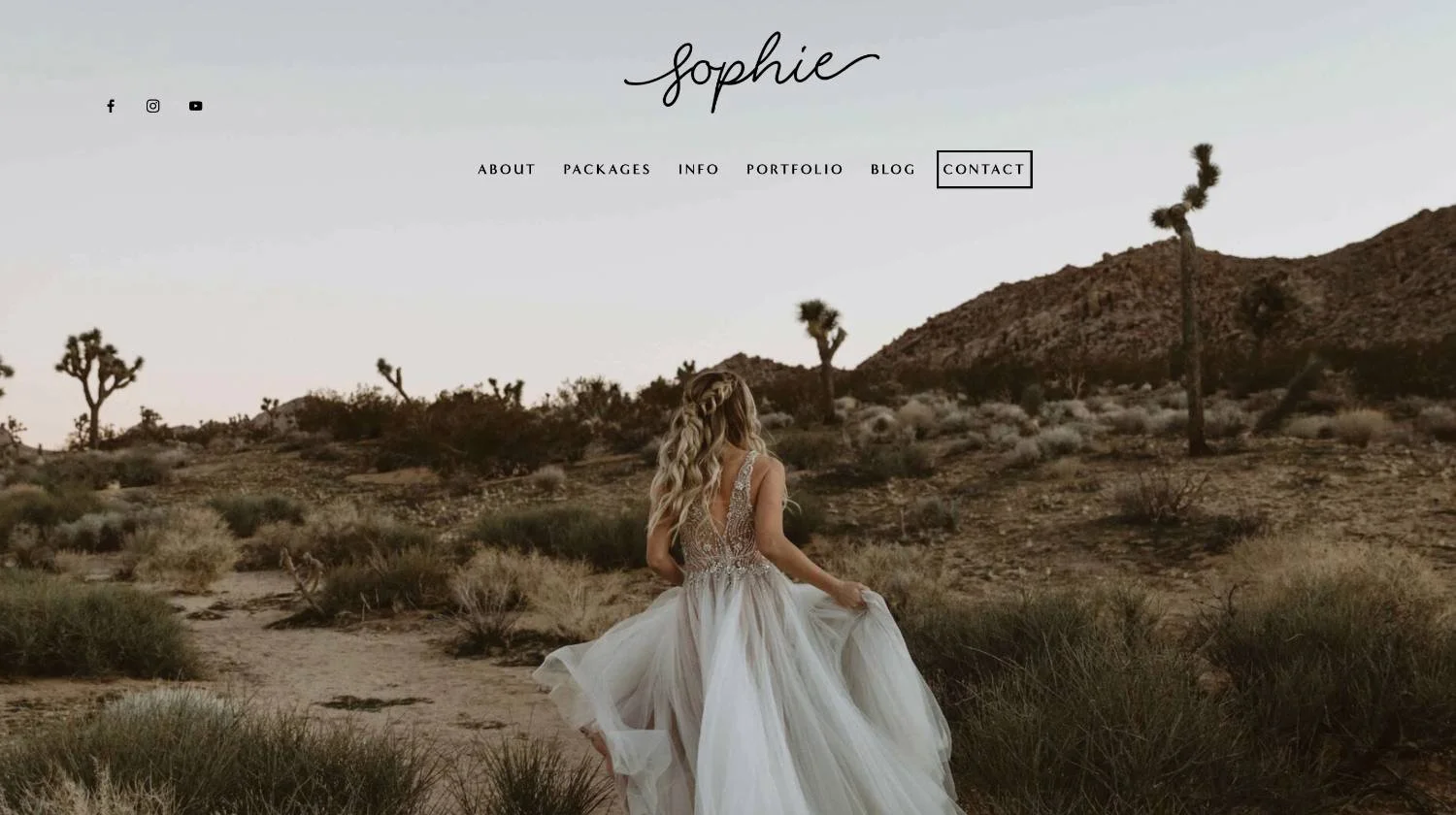
As you tab through your site, you should be able to see where you are on the page. This is usually shown with a visible outline, highlight, or focus indicator around the active link, button, or form field.
Try Testing:
Your main navigation
Dropdown menus
Buttons
Forms
Footer links
Mobile menus
Ask Yourself:
Can I move through the page in a logical order?
Can I see which link or button is currently selected?
Can I open and use menus?
Can I fill out forms?
Can I submit a form without using a mouse?
Do I get stuck anywhere?
For Squarespace websites, keyboard navigation is something you can and should test on the live site. Most standard links, buttons, and forms should be reachable by keyboard, but custom code, pop-ups, embedded tools, third-party plugins, sliders, and heavily customized design elements can sometimes create issues.
You don’t need to be super technical here. Just tab through your most important pages and look for anything that feels confusing, invisible, or impossible to use.
And there you have it! A more accessible website starts with small, thoughtful choices. You don’t have to get everything perfect overnight, but every improvement helps make your Squarespace site easier for more people to use.
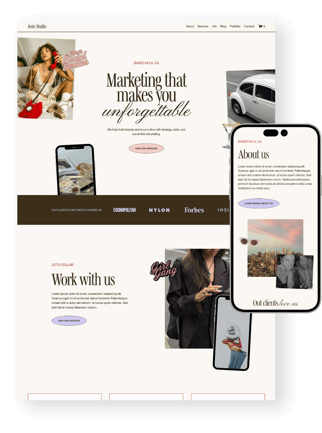
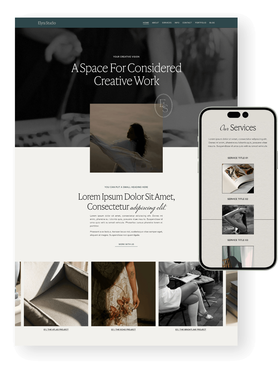
And if you’re starting from scratch, a well-structured template can give you a strong foundation for a site that feels clear, strategic, and user-friendly from the very beginning!
Explore Premium Squarespace Templates:





Want more Squarespace tips? Check out the posts below:
Squarespace SEO: Boosting Your Site's Visibility with our go-to SEO Checklist
How to optimize images for Squarespace
How to Design and Optimize Your Homepage for Better Results
Where to Promote Your Offers on Your Website (So They Actually Convert)
Website Pages That Will Increase Your Revenue (and you Should add Today!)
If you liked this post, Pin it to Pinterest! 👇🏻

Leon
7.1 Fluid Engine ✷ $297