

How to Change Mobile Logo on Squarespace 7.1 (Plus Code Solution for 7.0)
With the release of the new Fluid Engine editor in 2022, Squarespace has really upped their game when it comes to mobile-specific customizations, making the platform even better for those of us who love to keep it simple and custom-code free!
Among those new features, we’ve been loving how easily we can add a custom logo for mobile view only! Gone are the days of having to use the same logo for desktop AND mobile with tricky custom code as your only option to fix it (we’re looking at you 7.0 👀).
With a significant portion of all site visitors viewing websites on their mobiles, having a logo that is both readable and optimized for a mobile screen is a pretty crucial element to ensure that your business is recognizable and at its best in all screen formats.
In this post, we’re giving you an easy-peasy tutorial to learn how to update your mobile logo on Squarespace 7.1 (Fluid Engine). And if you’re still on Squarespace 7.0 (Brine), don’t worry we’ve got a tutorial and a little custom CSS ready for you too!
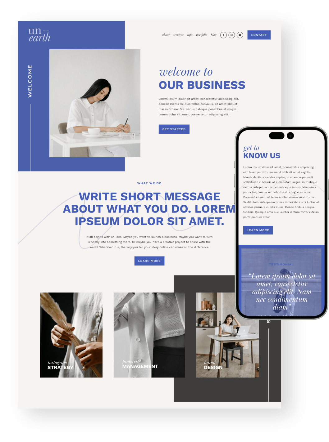
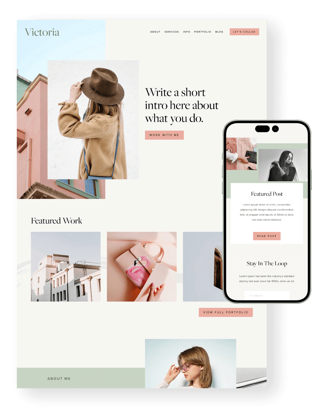
PS. Did you know that all of our Squarespace Templates are optimized for mobile from the get go? Not only will you get a beautiful design to start with, but you’ll also get hours of our most up to date tutorials all about learning Squarespace. Check them out below! 👇


Why is a Custom Mobile Logo Necessary?
With desktop and mobile screen sizes being so wildly different, it’s pretty common that a logo that looks amazing on desktop just isn’t quite right for mobile.
Take for example, a website refresh that we did a while back.
Everything had been looking great on desktop, but when we took a peek at the mobile site we quickly realized that it had been getting totally neglected. The biggest problem being, as you might have guessed it by now, that the logo we had on desktop just looked terrible on mobile view!
The desktop logo was big and round, which is absolutely fine for desktop view, but as soon as we got to mobile, we found that it was either too big or too small.
The mobile layout looked more balanced with the logo being smaller, but it wasn’t readable that way. If we wanted it to be readable, we had to make it bigger, which then made the navigation menu so big that it ended up basically taking up a quarter of the mobile screen. And when you’re working with a small mobile layout, that’s not ideal at all!
👉 How to Customize your Header Navigation in Squarespace 7.1 Fluid Engine
👉 How to Adjust Your Mobile Menu in Squarespace
The height of the menu looked good here, but the logo was so tiny that you couldn't really tell what it was, and you definitely couldn't read it!

The logo was clearer and more readable here, but the height of the menu become too large, taking up way too much screen space!

Bottom line, it had to go! So we created a new one. And thanks to the new Squarespace mobile customization features, we were able to add our new mobile logo in just a few simple steps.
Changing Your Mobile Logo in Squarespace 7.1 (Fluid Engine)
Important! This customization feature is only available on Squarespace 7.1 Fluid Engine websites. If you’re not entirely sure which version of Squarespace you’re using, read this post.
1. Create a Mobile Logo
If you don’t already happen to have something that will work for your mobile logo, then get designing!
Remember, you don’t have much space, so a simpler variation of your regular logo that can be easily read (even if shrunk down) is the way to go.
👉 Why you shouldn’t create logos in Photoshop
2. Upload your Logo
Go to your website and click Edit in the top left hand corner.
Hover over the top of your website and click Edit Site Header.

From here, click on your logo (or Site Title if you haven’t yet uploaded a logo) and then click on the Pencil Icon to edit your Site Title & Logo.

In the pop up menu, scroll to the bottom where it says Mobile Logo Image. Here, you’ll be able to drag and drop in your custom mobile logo! You can also click the + icon to upload a file or choose one that you’ve already added to your Asset Library.

To adjust the size of your custom mobile logo, scroll above to Mobile Logo Max Height.

Once you’re happy, exit the pop up menu then click Save and Exit. That’s All! 🎉
👉 How to get the right size for your Squarespace logo on Facebook (social sharing logo)
Changing your Mobile Logo in Squarespace 7.0 (Brine)
Important! The following code works only on Squarespace 7.0 Brine websites. If you’re not entirely sure which Squarespace version or template you’re using, read this post.
While the Brine template family has so many great customizable features that make it hands-down the best Squarespace 7.0 template family out there, one thing that isn’t easily changeable in Brine is the mobile logo.
To change it, there is some coding involved. And while most of it can be copy and pasted, we should note that some variables might need a little adjusting depending on your site settings and logo size!
1. Create a Mobile Logo
If you don’t already happen to have something that will work for your mobile logo, then get designing!
Remember, you don’t have much space, so a simpler variation of your regular logo that can be easily read (even if shrunk down) is the way to go.
👉 How to create hand lettered logos
2. Upload your Logo
To upload your custom logo into your Squarespace 7.0 website, navigate to the Assets tab in your main menu.

This will bring you to your Asset Library, where any image, logo, or video you’ve ever uploaded will be stored!

From here, you can click on Upload in the top right hand corner to upload a file directly from your desktop, or simply drag and drop your logo file into the main asset area.

3. Copy the Logo URL
After you’ve uploaded your custom mobile logo to your Asset Library, you’ll need to grab the file URL that’s been created for your logo.
To do this, hover over the logo you uploaded and click on the three dots in the top right corner of the image. Then click on File Details.

This will open a window with a supersized version of your logo as well as some specific details about the file itself.

To access the file URL, right click on your logo and click Copy Image Address.

From here, open up a new tab in your browser and paste in the URL that you just copied. You’ll know you’ve done the right thing when your logo appears (very largely) in the window!

Go ahead and leave this tab open, as you’ll be coming back shortly to copy the URL. You can also copy the URL and paste it into a note or document so that it’s ready to go when needed.
4. Add in the Custom Code
You’re almost there!
Head back to your Asset Library, and then navigate to your Pages Panel. From here, scroll to the bottom and click into Website Tools, and then click on Custom CSS.

Paste the following code into the CSS window:
Then, grab the file URL that you just accessed for your logo, and replace "https://yourdomainnamehere.com/s/yourfilenamehere.png" with the new custom URL. You can then adjust the max-height and min-height to whatever works for your logo.
We strongly recommend looking at the preview in Mobile View while you’re adjusting the max-height and min-height so that you can see exactly what it’s going to look like as you adjust!
To do this, click on the little horizontal line at the top of your website:

Then click on the mobile phone icon:

5. Check it on Mobile
Yay, you did it! The final step should be checking your new logo on a mobile device just to make sure that the code is translated properly and everything is looking perfect.
Changing your mobile logo on Squarespace is a small tweak that can make a big impact on how your site looks and feels on mobile devices. By following the steps above, you'll ensure your visitors have a smooth, professional experience no matter what device they're using. It’s all about making sure your brand shines—whether on a desktop or a phone!
And remember, the little details matter, so keep refining, and your site will keep getting better!
Feeling inspired to revamp your mobile presence? Take a peek at our website templates for a head start on creating a sleek, mobile-optimized site. We’ve got you covered! 👇
Loved that post? Check out more Squarespace tips below!
Mobile Optimization: Creating Responsive Squarespace Sites
How to Adjust Your Mobile Menu in Squarespace
How to center-align text in mobile ONLY in Squarespace
Hacks to make mobile editing in Squarespace Fluid Engine faster
If you liked this post, Pin it to Pinterest! 👇🏻
