

What I offer in my brand design packages

What’s in a brand?
I do a lot of brand designing over here at Big Cat Creative, it’s one of my primary services. But people are often confused as to what exactly a “brand” is.
Most often, people come to me looking to get a logo designed. I get it, the logo is one of the most important aspects of your brand, everybody knows what a logo is, but there’s much more to a brand than just a logo!
Today I’m going to cover exactly what I offer in my brand design packages, why I offer them, what they are and how you should use them, so you can gain some clarity on what a brand actually is, and how important it is.
First off, I will note, a brand is more than just design. It’s the complete vibe, tone and voice that you give off. So though a good brand design is really important, so are the words you use and the products/services you sell. All three of these things need to be in alignment and they need to serve a particular audience.
For example, if your target audience is males in their 50’s and your brand design is pink and gold, well, I’m sure you can see how that’s out of alignment. Same goes for copy, if you’re targeting males in their 50’s, you need to use the language they would use.
So a brand is not just about design. It’s how your design and copy work strategically to capture your target audience.
Before I start on a brand design for anyone, I have them fill out a Target Audience Questionnaire to make sure they have defined their target audience. This is a very important first step. Once they have really honed in on their target audience, we can start.
With all of that understood, here are the deliverables of my Brand Design Package:
Mood board
A mood board is a collection of images put together to create a certain ‘mood’. The reason we create a mood board for your brand before we create anything else is so that we can agree on the right 'vibe' or 'mood' of you brand before we start creating all of the collateral. It’s a way of making sure we are both on the same page with the feel of your brand. Once we have nailed the mood board, the rest of the brand design comes much more easily.
Below is an example of a mood board created for a luxury organic skincare brand.

Color palette
Having a consistent color palette for your brand is really important. People recognize colors, so if you have a strong color palette for your brand, people will begin to associate those colors with your brand. Think about some popular brands that completely own their colors like: Tiffany Blue, Coca Cola Red, John Deer Green. You can envision these colors straight away because these companies have done such a great job utilizing their color palettes, they almost wouldn’t be recognizable without them.
Here is an example color palette for the same luxury skincare brand:

Your color palette should be used throughout all of your brand collateral. From different colored variations of your logo, to your website, your social media, business cards etc. This creates a consistency across your entire brand which is important for brand recognition.
This is a little bit different when it comes to creating brands for clothing or apparel companies. Because popular colors come and go every season, often brands like this have to rely on their logo to be consistent, while their color palette changes often, to match their current line or whatever is currently in fashion.
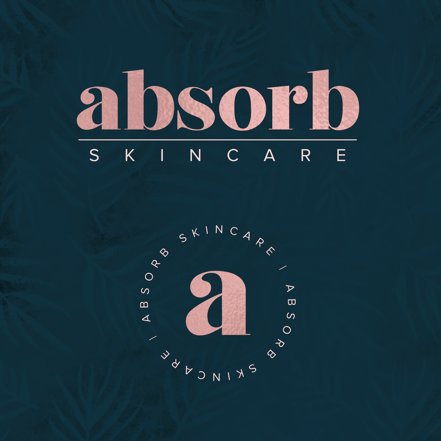
Logo
We touched on logos above as the most important aspect of your brand. We all know what a logo is, and we understand how important it is to have a good logo. In the brand design package I not only create a primary logo, I also create at least 1 alternative logo. So what’s the difference?
Alternative logos / submarks
Your primary logo should be used whenever possible, but, sometimes it just doesn’t work. I like to create a variation (or two) of your primary logo so you can use it in instances where you need a different size. I always create a variation of your logo that will fit well within a circle or square (aka Instagram and Facebook profile pics!) and depending on what your business is, sometimes you may need a watermark, or more of a simplified version of your logo. This comes down to your individual needs and what your business is!
Here is an example of the primary (top) and secondary logo/submark (bottom).
Favicon
A Favicon is a small icon that’s displayed next to your website name in the browser window (see the heart icon below). These are seriously underrated - your website looks 10x more professional when you add one of these babies! So if you are hiring me for a brand design only, I like to create one of these for you so you can pass it on to your web designer (or DIY it yourself).

Font combinations
Just like everything else in your brand design, your fonts need to be consistent too. I will choose between 1-3 fonts that work with your brand that should be used in all of your collateral. Usually there is a heading font and a body text font. This is important when it comes to designing graphics for social media, for print, or on your website. Firstly, if you are using too many fonts or different fonts all through your graphics, it will look unprofessional. Secondly, you want to pair fonts that actually look good together (this is where the professional designer eye comes in!). I’ve said it before and I’ll say it again, it’s all about being consistent throughout your brand, consistency = recognition!
Textures / patterns
Custom brand textures and patterns are another great way of adding some interest to your brand, while also keeping things consistent. I like to think of textures and patterns as an extension of you color palette. You use them in exactly the same way, consistently and unchanged throughout your brand collateral. Most brand designs can benefit for having a custom pattern or texture, some can easily use both throughout their collateral, but also some brands just don’t suit having patterns or textures. Again, this comes down to your individual business needs.
Here's an example of the patterns and textures I used in the same brand:

Branding style board
The branding style board is where everything comes together. This board is a display piece of everything we’ve worked on during the project and gives anyone who sees it a quick snapshot of your brand style. On the board I include your primary logo and alternative logos (usually in a variety of color examples), your color palette, you patterns and textures, your favicon, and any extra suggested graphic elements that may be used in collateral or your website.

PDF brand guide
The Brand Guide is a step up from the Branding Style Board. It includes everything that comes with the Branding Style board but more detailed brand design information such as logo usage rules, all of your color codes and primary/secondary colors, brand photography style recommendations and typography recommendations. This is recommended for larger companies that have large amounts of collateral, and great for businesses that often outsource design or printing work. This Brand Guide is a great referral tool and makes it easy for anyone to keep everything on brand/consistant. This guide only comes with the grand brand package, for more established businesses.
You’ll notice that I’ve said the word ‘consistency’ about 100 times in this post. The whole aim of creating a brand design is to create something that is consistent across all platforms and media, and of course, aligns with and attracts your target audience.
Consistency = Recognition. Recognition = Trust. Trust = Sales!

So, now you know what’s involved in creating a complete ‘brand’, and why they are all important aspects, are you ready to get started? Head on over to my brand design page and pick a package that works for you!