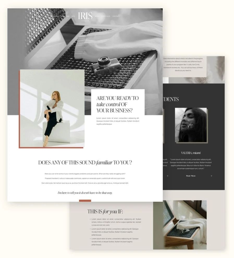
The 5 Must-Haves on Your Sales Page
Ah, sales pages, whether you love them, fear them, or are currently avoiding them altogether… if you’re running an online business and selling basically anything online, you’re going to need one of them!
Now, not all sales pages look the same. Some are epic, info-filled landing pages for your high-ticket offers. Others are short and sweet product pages, like your fave online store. But no matter what you’re selling, or how fancy your page is, there are a few non-negotiable elements every sales page needs if you want people to actually… you know… buy.
So today, we’re walking you through 5 must-haves your sales page cannot skip. Think of these as the core ingredients to bring the strategy. Nail these, and you’ll already be way ahead of the selling game ✨
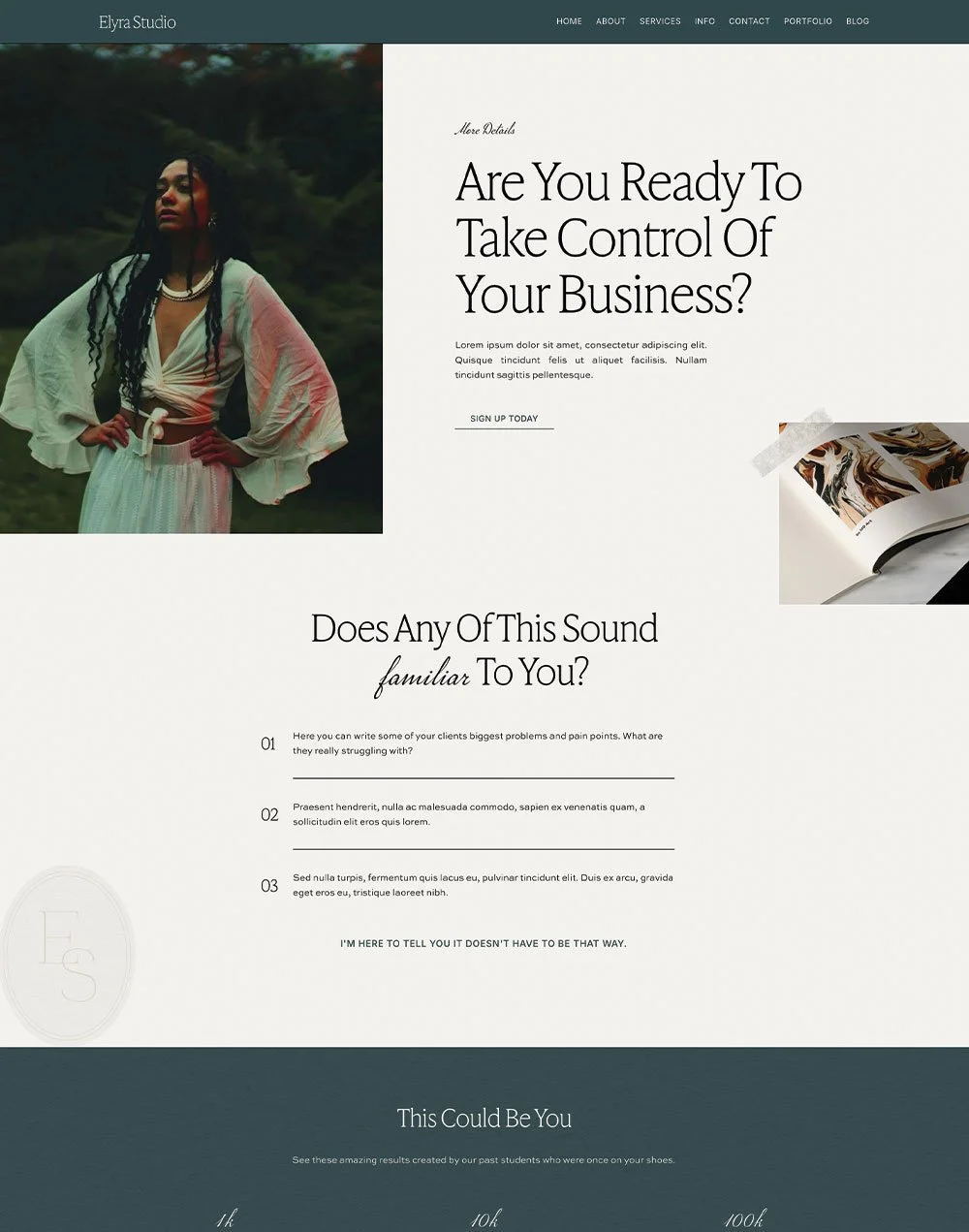
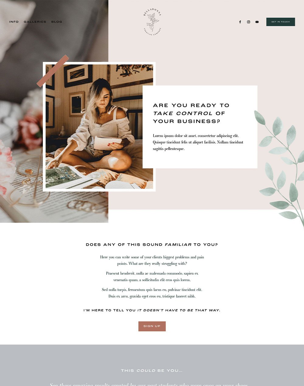
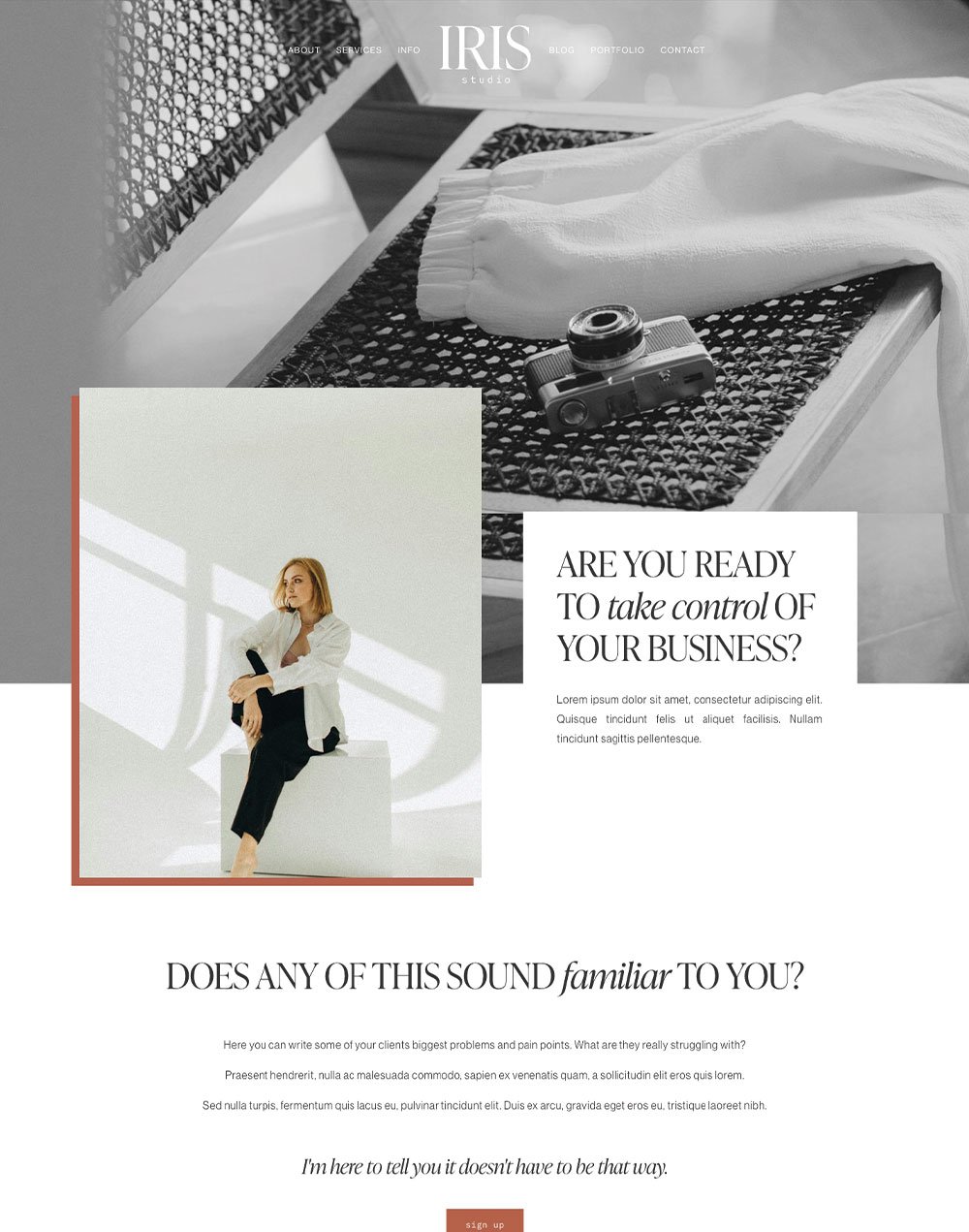
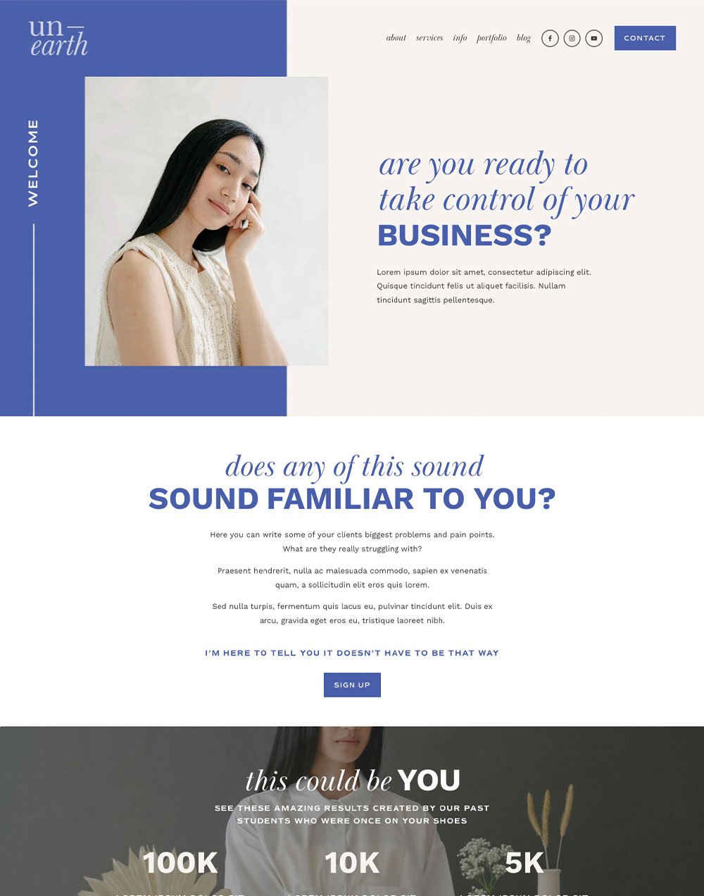
Want an extra boost to help you nail your conversions? Check out our strategically designed sales page templates for Squarespace:
Let’s dive in!
1. Clearly Explain What You're Selling, and the Key Transformation Your Product Provides
This one sounds super obvious… but you’d be surprised how many sales pages skip straight into hype-mode without actually explaining what the offer is. So let’s keep it simple:
👉 What exactly are you selling?
Is it a course? A template? A service package? A coaching program? A physical product? Spell it out. Plain and clear. No mystery. No guessing. No “you’ll find out when you buy 😉”.
Then, once your reader knows what the thing is, tell them:
👉 What difference will it make in their life or business?
Are they going to save time? Are they going to learn skills? Are they going to make money? Are they going to impress all of their friends? Are they going to finally be proud of themselves?
Whatever it is that your audience will get from this product, make sure they know it! The combination of what your offer actually is and what it will do for them will meet your audience right where they're at and speak to exactly what they need.
This is where your audience starts thinking… “Ohhhh. This is what I’ve been looking for.”
Clarity = confidence. And confidence = conversions 💫
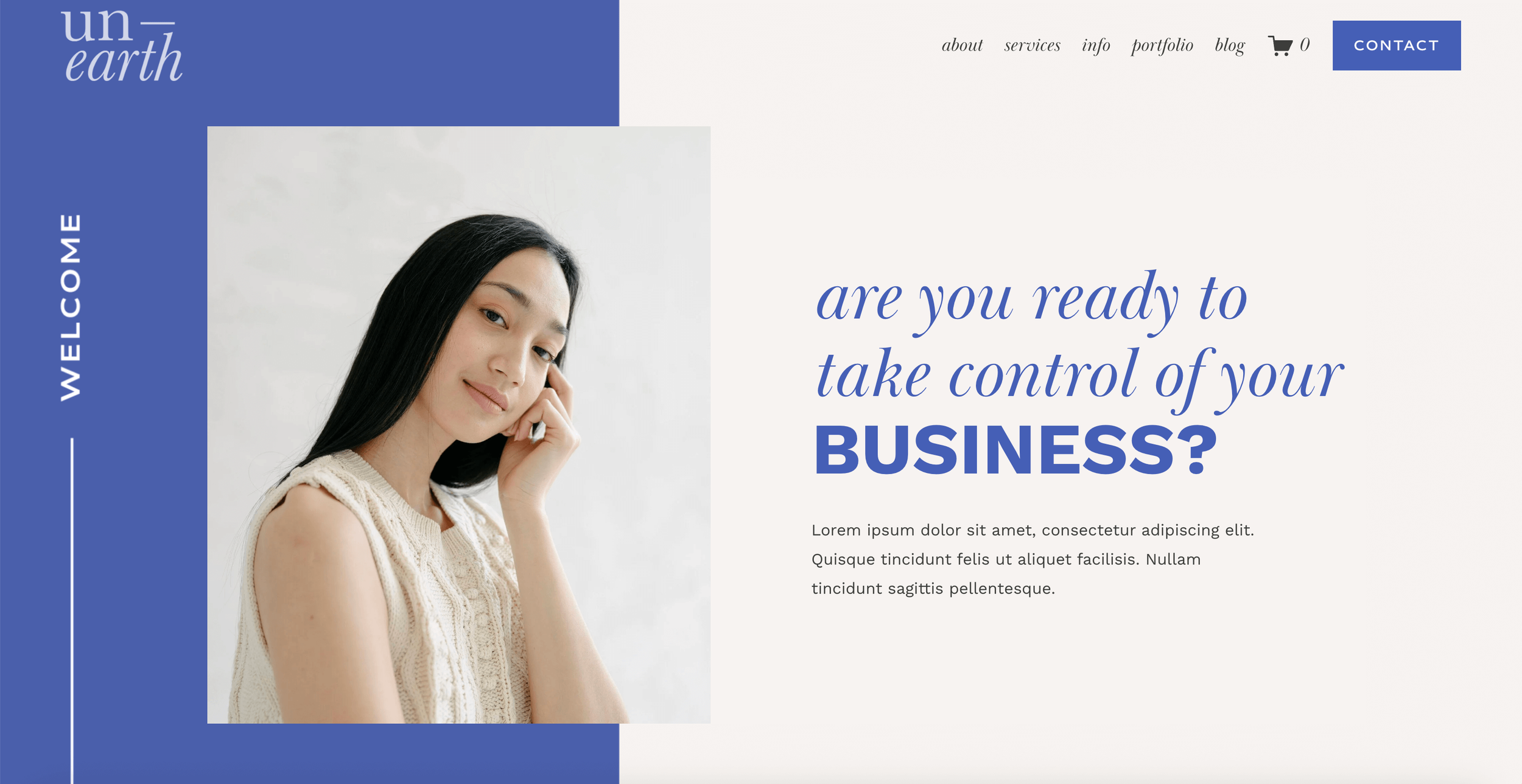
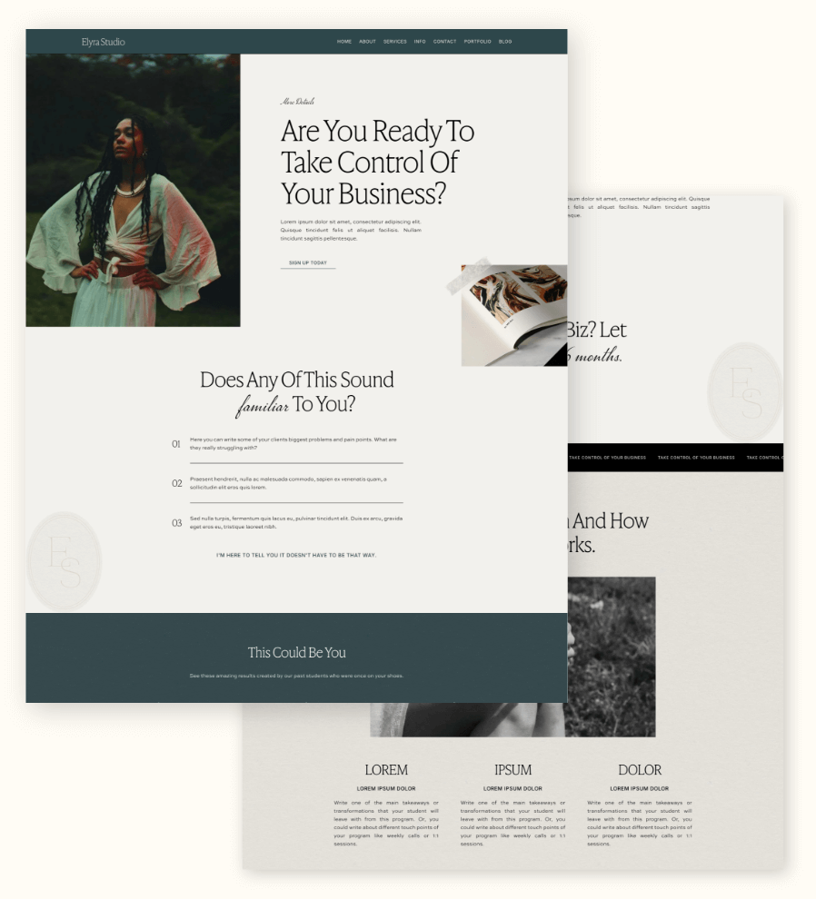
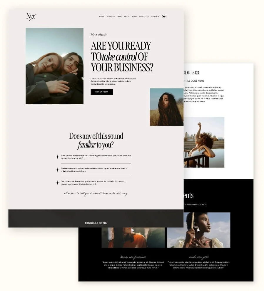
Example of a transformation statement in our Unearth Sales Page Template
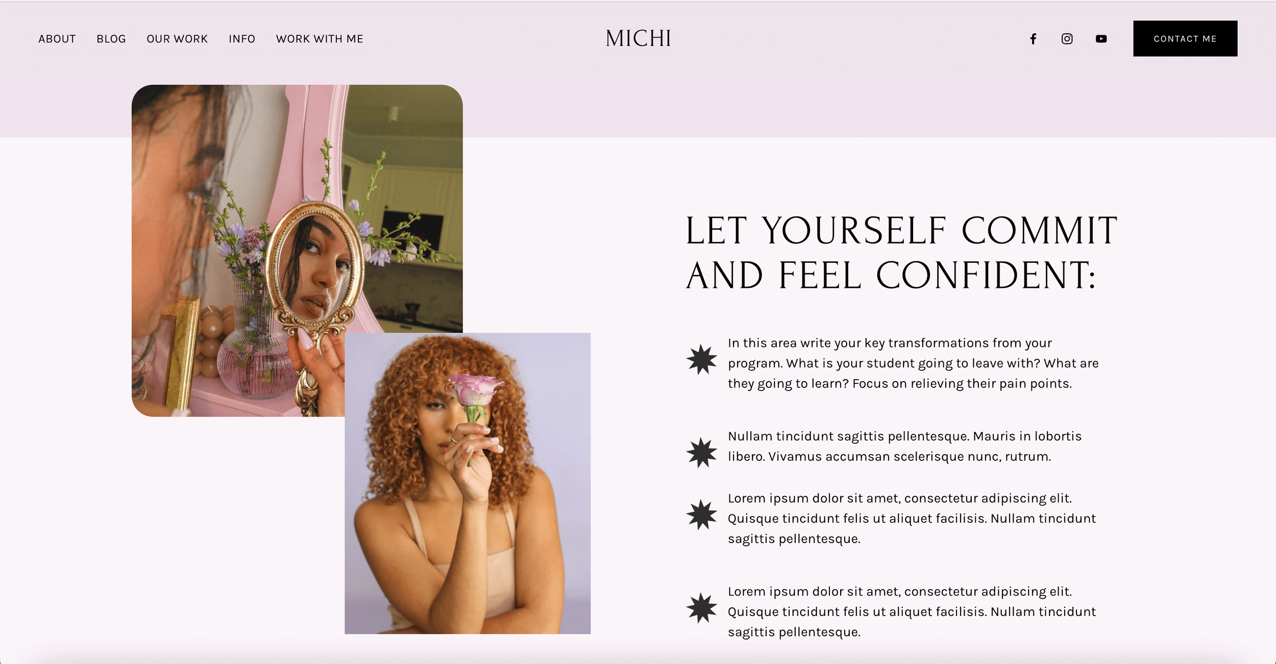
Example of transformation points in our Michi Sales Page Template
2. A Breakdown of Exactly What’s Included
Okay, now that your audience knows what your offer is and why it matters… it’s time to show them what they actually get when they buy.
👉 Why this is necessary?
There are two types of people: those who will purchase based on minimal information because they feel the transformation and that's all they need to hit the buy button, and those who like to know every single detail about what they're getting before they hand over their money.
Your job is to speak to both types of humans, finding a balance to please both (without turning your sales page into a never-ending scrollathon).
Some sales pages focus so much on the transformation that you’re left thinking, “Okay… but what am I actually buying?” Others list 173 features and totally forget to connect them back to the result. You want to make sure you have both.
👉 The strategy
So this is where you get specific:
What’s included in their purchase?
What do they get access to?
How does it actually work?
Think: workbooks, modules, coaching calls, templates, tutorial libraries, bonuses — all of it. Then break those elements down just enough so your audience feels informed, confident, and excited.
And bonus? The more clearly you explain what’s included, the fewer “Hey, just checking…” emails you’ll get.
Example of a “how it works” section in our Gigi Rose Sales Page Template
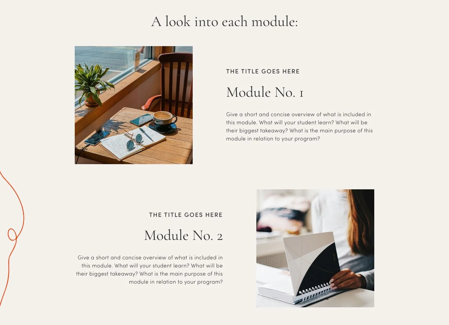
Example of the modules breakdown section in our Nova Sales Page Template
3. Who This Is (and Isn't) For
This is one of our fav parts of a sales page because it does some seriously powerful work. This section helps you attract the exact people your offer was created for (aka who you want to buy)… and gently guide away the ones who won’t get the best results from it, making it super helpful for everyone involved.
👉 Why this is necessary?
Firstly, this is your business. You’re allowed to be intentional about who you want to work with and who your offer best serves.
Secondly, if you are specific about the person you want to sell this product to, that means you are going to get the perfect person to buy the offer, which means that the product is going to be perfectly aligned for them, and they are going to see the best results. It's a win-win for you and your clients.
With that same thinking, listing who this product isn't for will help you filter out people that this offer just really won't be able to help. Saving those people from investing (aka saving them money) in something that was never going to be right for them in the first place.
So, cut-throat? Or, just really considerate? I'd say the latter!
👉 The strategy
Consider your offer and who exactly it was made for. If you don't have an ideal client mapped out yet, then we highly recommend figuring that out asap (really, this is something to focus on before you start a business and create an offer!).
If you know who your ideal client is then you should be able to list out key traits in them that make them perfect for your product. Then, think of the opposite person, and use that to help you write out the 'this isn't for you if....'.
For example, if your ideal client is a self-starter, driven and independent, they would be perfect for a course where there is a lot of DIY and self-directed learning. Eg.
⭐ This course is for you if: You are motivated to learn and will hold yourself accountable to complete the course content in your own time.
A person who you don't want to be included in this course is someone who is the opposite of those traits or expecting something different:
⚠️ This course isn't for you if: You are looking for lots of accountability, coaching, and 1:1 direction from us.
Aside from just personality traits that make people right for your offer, you can make a more tangible list of things if your product allows for it, too.
Take our Squarespace Sales Page Templates as a basic example:
⭐ This product is for you if: You already have a site on Squarespace, or you are planning to build your site on Squarespace.
⚠️ This product isn't for you if: Your website is hosted on a platform that isn't Squarespace.
Simple, right?
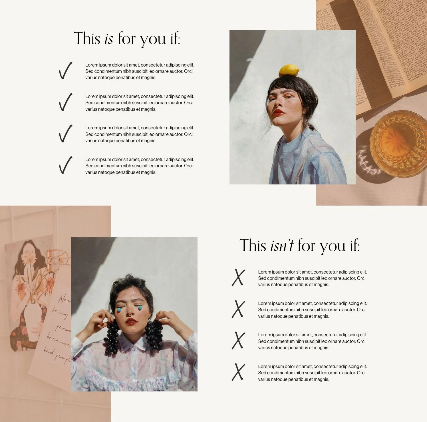
Example of a “This is for you / This isn’t for you” section in our Ava Grand Sales Page Template
👉 A note of encouragement
Yes, this section will alienate some people. But that’s kind of the point!
You only want people to purchase your offer who are the right people. Having the wrong people purchase your offer is only going to end up in disappointment, extra admin, refunds, bad reviews, and just all-around bad vibes.
Sure, if you write a long list of people who shouldn't purchase, you will lose those people and their potential money. But, if you get really specific about the people who you want to buy, you will attract more of these people to purchase.
Really, it evens itself out. You're making the same amount of sales, but the people are better suited for your offer.
4. Pricing + Purchase Options
Another no-brainer, right? You'd think so. But pricing + purchasing can be a bit of a conundrum...
Do I even give a price?
What if my prices vary depending on the service?
How should I display pricing?
Which pricing options should I offer?
Ok, so, maybe less of a no-brainer than you thought.
The strategy behind pricing does depend on the type of product you're selling and how expensive it is.
👉 Should you display your pricing?
Short answer: Yes. Always. Do not make people contact you for a price.
Please don’t make people dig through emails or book a call just to find out how much something costs. Unless your clients are literal billionaires, they want to know whether your offer is in their budget, upfront, without the awkward mystery.
Transparency builds trust. And trust builds sales. 💸
👉 But what if your prices vary?
Totally okay! If your service is custom or flexible, simply share a “starting at” price.
This gives potential clients:
a realistic idea of your price range
the chance to self-select based on budget
fewer surprises later on
Then invite them to get in touch for a tailored quote. Easy!
👉 How should you display your pricing?
Make it obvious. Like… unmissable.
If your sales page is long, sprinkle your pricing (and purchase buttons!) throughout the page so people don’t have to scroll forever to find it. And if your offer is available to buy instantly, place a Buy Now button right near the price so there’s zero friction.
The key is to make purchasing your product easy and very accessible!
👉 Should you offer different pricing options?
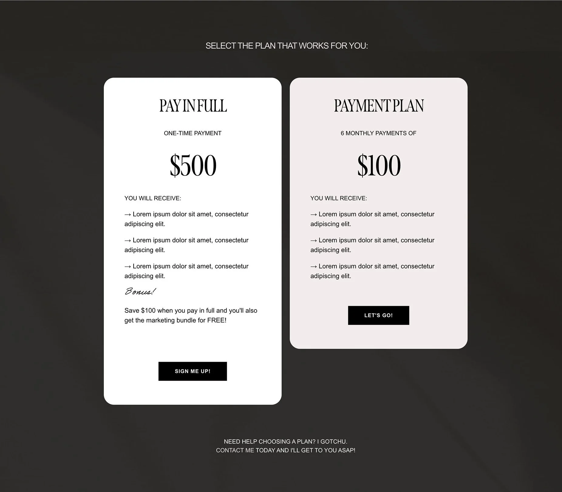
If your product is a high ticket item, including different pricing tiers or payment plans is a GREAT idea.
Including payment plans for high ticket products and offerings will no doubt increase your overall conversion rate. Lots of people are reluctant to make big purchases at one time, but if they see it broken down into smaller pieces, especially monthly to compare to their monthly income, it makes it much more achievable.
Example of a pricing table in the Nyx Sales Page Template
Frequently Asked Questions
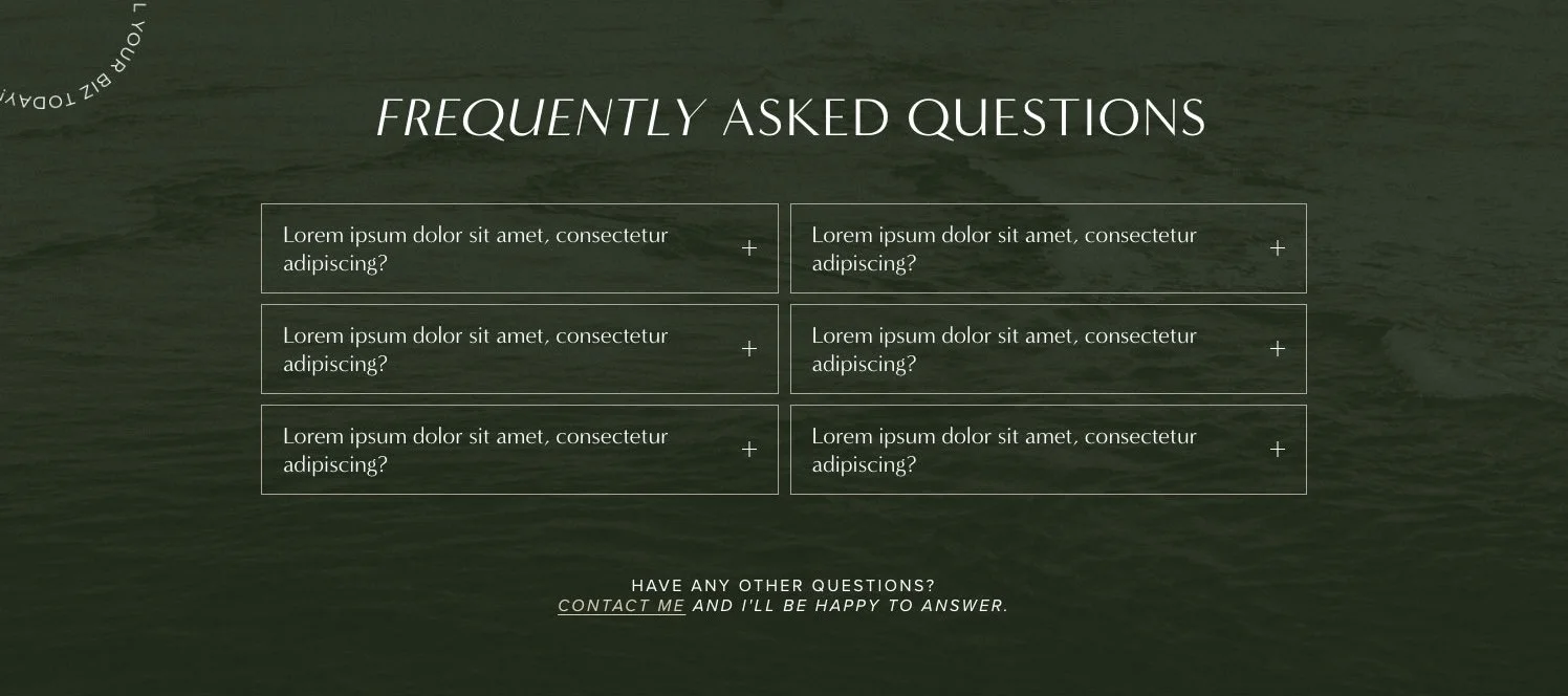
Finally, good ole FAQs! ALWAYS include FAQs.
These are lifesavers on a sales page. We look at them as essential information that doesn't really "fit" anywhere else on the page. Often answering questions that customers didn't even know they had in the first place.
If your product is new, you may not even have actual questions being asked just yet, that's fine, make them up!
Consider the questions that might be asked or areas where your audience might get caught up or misunderstand something, and cover this in the FAQs. You can also take prompts from the stuff we covered above (pricing, who is this for, what's included, etc) and elaborate on this if you think it will be helpful.
Of course, if you are already getting consistent questions from potential customers, then write these down!
We always keep a running list of questions that people ask. If they get asked more than a few times (aka frequently) or it's something we think is essential to understand the offer, then they get added to the sales page FAQs!
Example of an FAQ section in the Noire Sales Page Template
Bonus Tip: Good Design Sells!
All the strategy we’ve talked about so far? Huge. Essential. Necessary.
But there’s one more piece of the puzzle we cannot ignore:
✨ Good, strategic design.
You could have all of the strategies in the world, but if you don't include design in that strategy, your sales page will feel clunky, confusing, or chaotic and just isn't going to perform well.
The opposite applies too, pretty design with no strategy will get you nowhere!
The magic happens when strategic copy + intentional design work together. That’s when your sales page becomes clear, compelling, confidence-boosting, and actually converts.
If you are DIYing your sales page, read about why we recommend using Squarespace for your sales page.
And if you really want to make designing your sales page in Squarespace easier, make sure to check out our Squarespace Sales Page Templates. They are:
Strategically structured
Thoughtfully designed
Built inside Squarespace
Easy to customize (even if you’re not techy)
Come with tons of tutorials to help you launch
Go take a peek! Your future sales page (and your sanity) will thank you 💛
If you liked this post, Pin it to Pinterest! 👇🏻


